Shades of Ink Residential by Studio One |
Home > Winners > #139911 |
 |
|
||||
| DESIGN DETAILS | |||||
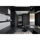
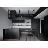
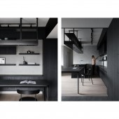
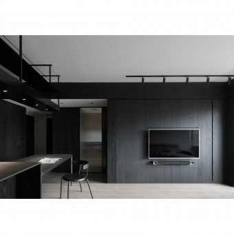
| DESIGN NAME: Shades of Ink PRIMARY FUNCTION: Residential INSPIRATION: The design inspiration was derived from the concept of Traditional Chinese Ink Painting with tone variations. One of the principles of Ink painting is that the center theme or subject is often portrayed as the darkest tone while the background with the middle tone and also some space remained blank/void. This method provides a sense of distance sensation, also emphasize on its core theme. In this project we took it as an canvas, we introduced concise lines, forms and monochrome colors, which aims to provide different perspective or perception towards space itself, and discovering the true aesthetic value and essence of being. UNIQUE PROPERTIES / PROJECT DESCRIPTION: This project was tailored by introducing sophisticated forms and monochrome scheme with textured materials. An interior project with limited space, the design goal is to maximize the possibilities and flexibilities towards the space. With the concept of essence in simplicity, designer minimized design volumes. The monochrome scheme with ink-black wood paneling and light gray mineral paint, brings out a sense of serenity yet with interesting textures contrast, aims to create a space with varied expressions that sculptured by natural light. OPERATION / FLOW / INTERACTION: An interior project with limited space, the design goal was to maximize the possibilities and flexibilities towards the space. We applied the ink-black wood wall (with storage in it) to set a clear boundary between foyer and kitchen while using semi-transparent sliding door to create blur boundary, which also helps to create the depth of a space. In order to solve the sunlight only came in from one side issue, we only designed ceiling part along with foyer axis, and left the center area as its original height to reducing oppression and also allow the space to absorb the sunlight as much as possible. For this smaller scale of space, we aimed to stay with the monochrome scheme with tone and texture differentiations, alone with sleek design lines and details, both of these features allows to create a sense of serenity, also brought out the essence in simplicity. PROJECT DURATION AND LOCATION: The project started in April 2020 and finished in October 2020 in Taipei City, Taiwan. FITS BEST INTO CATEGORY: Interior Space and Exhibition Design |
PRODUCTION / REALIZATION TECHNOLOGY: In order to achieve the openness and cohesiveness flow within the space, for architectural aspects, designer demolished unnecessary architectural wall and applied sliding partitions to create a space with flexible/blur boundaries between each zones, hence the boundaries was shaped based on client’s needs. As to correspond to the inspiration from Traditional Chinese Ink Painting, designer applied the monochrome scheme with varied tone change as well as the textures from different material, such as ink-black wood paneling wall with wood grain, middle gray ceramic tile with stone-like pattern and light gray mineral paint with artisan’s touchup. The space is sculptured by monochrome scheme yet with abundant texture expression and contrast. SPECIFICATIONS / TECHNICAL PROPERTIES: The area of this project is 70sq. m2, which contains foyer, living/dinning room, two bedrooms, two bathrooms and kitchen. TAGS: Interior Design, Interiors, Residential, Design, Minimalism, Contemporary RESEARCH ABSTRACT: a)How to maximize the space- In order to maximize the space with more possibilities and flexibilities, designer needs to rearrange the architectural walls at its best. Prior to do that, designer needs to decide the area for each zone based on analyzing owner’s life habit. b)How the materials were selected- Materials were selected based on its natural traits and texture. For the ink-black wood and light gray mineral paint, designer keeps its wood grain and artisan’s touchup, both provides abundant material expression under monochrome scheme. CHALLENGE: The challenge was to maximizing the small interior space with more possibilities and flexibilities. How the space or zones were defined without setting up a clear or solid boundaries is the key design objective towards this project. Also, under the monochrome color scheme, how to create warmth and visual texture in the place. ADDED DATE: 2022-03-25 08:27:57 TEAM MEMBERS (1) : IMAGE CREDITS: Photo Credits: MD Pursuit PATENTS/COPYRIGHTS: STUDIO ONE ALL RIGHTS RESERVED. |
||||
| Visit the following page to learn more: https://www.studiooneinterior.com/projec |
|||||
| AWARD DETAILS | |
 |
Shades of Ink Residential by Studio One is Winner in Interior Space and Exhibition Design Category, 2021 - 2022.· Read the interview with designer Studio One for design Shades of Ink here.· Press Members: Login or Register to request an exclusive interview with Studio One. · Click here to register inorder to view the profile and other works by Studio One. |
| SOCIAL |
| + Add to Likes / Favorites | Send to My Email | Comment | Testimonials | View Press-Release | Press Kit |
Did you like Studio One's Interior Design?
You will most likely enjoy other award winning interior design as well.
Click here to view more Award Winning Interior Design.


