DESIGN NAME:
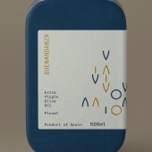
Buenandanza
PRIMARY FUNCTION:
Packaging
INSPIRATION:
The inspiration comes from the aim to live day by day, making your own way, freeing yourself from preconceived ideas and opening yourself to experience.
The idea symbolises serenity, balance and simplicity, all summed up in a unique claim: the lived experiences. The name is a key part in conveying that idea. The characteristics balanced, restrained, modest and intriguing, are qualities which stand out in the design and how it should be perceived.
UNIQUE PROPERTIES / PROJECT DESCRIPTION:
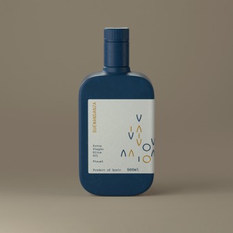
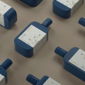
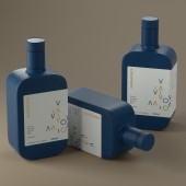
The bottle seems to have two skins: the blue colour of the packaging and the white wrap-around label. These finishes provide a pleasant and warm drinking experience. The rounded shapes of the bottle and the thickness convey quality.
OPERATION / FLOW / INTERACTION:
The bottle is small and robust, easy to use with a non-drip, non-refillable DOP cap. The opaque and tinted glass prevents light from penetrating and thus facilitates the conservation of the oil.
PROJECT DURATION AND LOCATION:
The project started in november 2021 in Ubeda and finished in january 2022.
FITS BEST INTO CATEGORY:
Packaging Design
|
PRODUCTION / REALIZATION TECHNOLOGY:
Tinted glass, paper label and stamping.
SPECIFICATIONS / TECHNICAL PROPERTIES:
100 x 57 x 176 mm. 500ml capacity. Glass and label
TAGS:
packaging, design, package, branding
RESEARCH ABSTRACT:
In order to emphasise the concept, a deep dark blue colour was employed, a tone which is associated with serenity. The pourer bottle cap of that same colour is used to lengthen the packaging. The label was designed white to give a more natural look. The symbols represent the possibilities in life that come up when freeing oneself from preconceived ideas. Both the circle and the triangle are inspired by the pointy shape of olive leaves and the oval shape of olives, with a touch of gold to enhance the distinctive character. The muted colour palette, the composition and the label aim to create visual harmony.
CHALLENGE:
The challenge was to open up to a target that seeks to connect with a more conscious rhythm of life in a frenetic world that is disconnected from its own essence. It is intended to connect with consumers who seek to live in a calmer and more contemplative way. The design had to stand out from the traditional brands in the oil sector and communicate Goodwill in simple terms. Two types of finishes are used to broaden the user experience: tinted glass bottle and textured paper label.
ADDED DATE:
2022-03-24 12:47:51
TEAM MEMBERS (1) :
IMAGE CREDITS:
Antonio Cuenca, 2021.
|
