Hightail Packaging by Angela Spindler |
Home > Winners > #139774 |
 |
|
||||
| DESIGN DETAILS | |||||
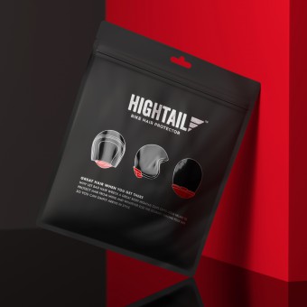
| DESIGN NAME: Hightail PRIMARY FUNCTION: Packaging INSPIRATION: The inspiration for the project was based on the concepts of freedom and simplicity both associated with riding motorbikes. The product is designed to give you greater freedom with your hair and the simplicity is the ease with which it can be used, both of which needed to be translated directly in to the packaging itself. UNIQUE PROPERTIES / PROJECT DESCRIPTION: Name creation and tone of voice as well visual identity and packaging design for an innovative motorbike helmet accessory. Brief criteria included, having unisex appeal. packaging that could be reused, high product visibility and light weight to ensure cost effective freight costs. OPERATION / FLOW / INTERACTION: Simple tear apart packaging with a zip lock closure for reuse. PROJECT DURATION AND LOCATION: 2017-2019, Sydney Australia FITS BEST INTO CATEGORY: Packaging Design |
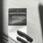
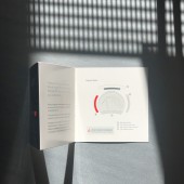
PRODUCTION / REALIZATION TECHNOLOGY: The sleek and unique multi-layered film pouch we have designed met all of the client’s requirements, as well as containing everything the purchaser needs to get up and running; the product, attachment clips, spacer and how-to brochure. SPECIFICATIONS / TECHNICAL PROPERTIES: Gravure printing Packaging: Zip lock Foil pouch - PET Foil and PE Foil, printed with 4 spot colours with a matte varnish and spot UV gloss varnish Offset printing Instruction Booklet: Single sided coated paper board, printed 4 spot colours with a machine varnish and Spot UV gloss varnish TAGS: Pouch Packaging, Packaging Design, Branding Design, Logo Design, Packaging Inspiration, Hightail Packaging Design RESEARCH ABSTRACT: Research around behaviour and attitudes of bike riders was necessary to identify best means of communication benefits of the product. The product of the packaging was key to supporting all of the clients criteria. For product visibility we selected a frosted film, to highlight the black product we laminated a red film to the reverse side of the foil. Using foil, coloured film and frosted film together enabled us to achieve the exact look we wanted and reduce the number of cylinders required to print, therefore affording the client reduced production costs. CHALLENGE: The project spanned over a two year period, due to the product development, which made maintaining continuity of thought more challenging. ADDED DATE: 2022-03-24 03:35:16 TEAM MEMBERS (3) : Angela Spindler - Creative Director/Designer, Anna Lee - Copy writer and Anneke Decker - Finished artist/technical illustrator IMAGE CREDITS: Angela Spindler, 2021. |
||||
| Visit the following page to learn more: https://www.wearedepot.com.au | |||||
| AWARD DETAILS | |
 |
Hightail Packaging by Angela Spindler is Winner in Packaging Design Category, 2021 - 2022.· Read the interview with designer Angela Spindler for design Hightail here.· Press Members: Login or Register to request an exclusive interview with Angela Spindler. · Click here to register inorder to view the profile and other works by Angela Spindler. |
| SOCIAL |
| + Add to Likes / Favorites | Send to My Email | Comment | Testimonials | View Press-Release | Press Kit | Translations |
| COMMENTS | ||||||||||||
|
||||||||||||
Did you like Angela Spindler's Packaging Design?
You will most likely enjoy other award winning packaging design as well.
Click here to view more Award Winning Packaging Design.


