Top Mercury Web Design by Daniel Houle |
Home > Winners > #139506 |
 |
|
||||
| DESIGN DETAILS | |||||
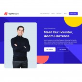
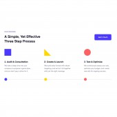
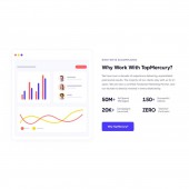
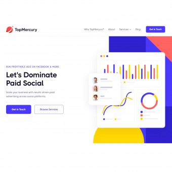
| DESIGN NAME: Top Mercury PRIMARY FUNCTION: Web Design INSPIRATION: Top Mercury wanted their new website to allow them to stand out from the competition. During the creative process, it was critical for Azuro Digital to think outside of the box. The end-product is a result of Azuro Digital's abstract thinking, coupled with best practices that optimize a website's conversion rate. UNIQUE PROPERTIES / PROJECT DESCRIPTION: Top Mercury, a social media advertising agency, hired Azuro Digital to create their new website. Azuro Digital used elegant motion effects and unique illustrations to deliver an immediate WOW factor. The website was designed to deliver a modern, cutting-edge aesthetic that separates Top Mercury from their competition while attracting large clients to work with them. OPERATION / FLOW / INTERACTION: This website features an elegant design and subtle movement through several motion graphics, motion effects, animations, illustrations, etc. Many of the sections can be interacted with via buttons, links, etc. PROJECT DURATION AND LOCATION: Azuro Digital began this project in January 2022 and finished in March 2022 (in Toronto). |
PRODUCTION / REALIZATION TECHNOLOGY: This website was designed with Figma and developed with Webflow. Figma is widely considered one of the best web design tools, while Webflow is widely considered one of the best web development tools. SPECIFICATIONS / TECHNICAL PROPERTIES: A website designed with Figma and developed with Webflow. The website is fully responsive on all devices, browsers and screen sizes. TAGS: Clean, modern, colorful, motion graphics, motion effects, unique illustrations RESEARCH ABSTRACT: We analyzed the competitors in the digital advertising industry. Our goal was to get an understanding of design best practices, and then design something that stands out from the crowd. Our measure of success is the website's conversion rate. We set up conversion tracking using Google Data Studio. We did industry research to determine what a strong conversion rate is. We found that a strong number was 5% based on top competitors. Our goal was to exceed 5%, and we achieved a conversion rate of 8%. CHALLENGE: The greatest challenge throughout this project was creating illustrations and motion graphics that produced a WOW factor, while simultaneously ensuring that the website wouldn't overwhelm the user. Having an overly complex design with tons of motion can easily distract and confuse the user, which can negatively impact the conversion rate. So, we had to find the perfect balance between creating an extravagant design and having an intuitive user experience. ADDED DATE: 2022-03-20 19:14:58 TEAM MEMBERS (1) : IMAGE CREDITS: All graphics and illustrations were designed from scratch by Azuro Digital. All images are stock images from Canva. They are all royalty-free and we have the rights to use them. The only image that isn't a stock image is the image of Top Mercury's founder, Adam Lawrence, and he has expressed his consent to being featured in this award. |
||||
| Visit the following page to learn more: https://www.topmercury.com/ | |||||
| CLIENT/STUDIO/BRAND DETAILS | |
 |
NAME: Azuro Digital PROFILE: Azuro Digital is an award-winning Canadian web design and development agency with over 100 five-star reviews online. |
| AWARD DETAILS | |
 |
Top Mercury Web Design by Daniel Houle is Winner in Website and Web Design Category, 2022 - 2023.· Read the interview with designer Daniel Houle for design Top Mercury here.· Press Members: Login or Register to request an exclusive interview with Daniel Houle. · Click here to register inorder to view the profile and other works by Daniel Houle. |
| SOCIAL |
| + Add to Likes / Favorites | Send to My Email | Comment | Testimonials | View Press-Release | Press Kit |
Did you like Daniel Houle's Web Design?
You will most likely enjoy other award winning web design as well.
Click here to view more Award Winning Web Design.


