Allys Coffee Packaging by Meghana Reddy |
Home > Winners > #138867 |
 |
|
||||
| DESIGN DETAILS | |||||
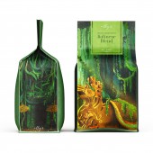
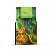
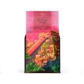
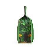
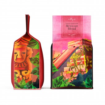
| DESIGN NAME: Allys PRIMARY FUNCTION: Coffee Packaging INSPIRATION: When the brand reached out with the concept, the idea was to come up with the most unique design for a coffee bag. It was important to make sure the consumers got a taste of different cultures through the fresh earthy visuals. The trees and vines in Bali and the sunset over Chichen Itza in Mexico inspired the unconventional illustrations that were hand-painted on the packaging. The concept and design are faithful to the Balinese and Mexican styles, with their simplicity and a minimalistic yet vibrant color palette. UNIQUE PROPERTIES / PROJECT DESCRIPTION: What makes the product unique from the other products in the market is, the fact that it isn't the usual coffee packaging design, the illustrations of the design were hand-painted and printed on sustainable and reusable packaging. OPERATION / FLOW / INTERACTION: Flat Bottom Coffee Pouch Bag with One Way Degassing Valve and Pull Tab Zipper. The tab needs to be pulled first to unlock the zipper. Once the bag is open, use the product as needed and squeeze the zipper to seal the bag after use. The bag is flat bottom and stands up steady. The degassing valve keeps the coffee dry and fresh. The bag's interior is made up of a high barrier three-layer lamination, which is non-toxic and odorless and obtains food-grade certifications. It is high-quality and environment protective. PROJECT DURATION AND LOCATION: This project started in September 2019 and was launched and sold in multiple stores across South India in March 2020 FITS BEST INTO CATEGORY: Packaging Design |
PRODUCTION / REALIZATION TECHNOLOGY: Reusable, sustainable, and eco-friendly paper bags that were made from natural resources, such as seaweed and hemp. SPECIFICATIONS / TECHNICAL PROPERTIES: Hold 8 oz (0.5lb) coffee ground or bean - Volume may vary depending on the fineness of ground coffee; One Way Degassing Valve, Resealable zipper, Flat Bottom for better Shape. Dimensions: 19.5 cm (7.7 in) height x 12.5 cm (4.9 in) length x 6 cm (2.36 in) width TAGS: #packaging #packagingdesign #illustration #coffee #coffeepackaging #art #painting #visualartist RESEARCH ABSTRACT: It was vital to start with a lot of online research about the Balinese and Mexican cultures. This research helped in staying true and authentic to the design. The goal wasto achieve marketing objectives by effectively communicating the personality or function of a consumer product and generating a sale. The most important step was the briefing stage. It is the most crucial stage because it is the first step and it it vital to gather all the right information in order o avoid going in the wrong direction in terms of design, look and feel. It acts as a roadmap where the most important aspect here is the clients feedback and input. It helps gathering and understanding the psychology of the client, more in-depth. Following this, it was critical to begin the project planning stage, where planning is a predetermined path of action that helps us to construct a project framework that is systematic. At this stage, issues like as budgeting, quality, and timelines were discussed. The half-battle is frequently won by the grand strategy. The research was done in three steps, which includes, the client research, market research and the design strategies. It is also crucial to include the design of the dieline in the design strategy stage. As the brand wanted to achieve being unique in the market, it was important to make the dieline of the packaging reflect the same goal. The lead designer also laid out the earliest versions of the dieline using Adobe Illustrator. The most significant aspect of packaging design was including and ensuring that the box adhered to regulatory criteria, such as barcodes, ingredient information, nutritional facts, FSSAI and customer support numbers, and so on. The designer hand painted the final illustration and then transferred it digitally to make finals edits on software's like, Adobe Photoshop and Illustrator. The client had initial laid out specific requirements including, brand identity, color, target audience, font, design ideas, by collaborating and brainstorming with the lead designer. Once the client approved the hand painted illustrations, feedback was provided and revisions were made. The objective was to ensure the final design communicated the intended output. The print files required to be kept ready for printing after a satisfactory round of changes. After the product is launched in the market, the actual market provides input on the packaging. The product was first introduced in the south of India, where it was a huge success. The client is discussing the possibility of producing new items with similar design themes. CHALLENGE: One of the most important parts of packaging design is color. Consumers are more likely to recognize a box or product by its color followed by thevisual element. It was challenging to find the right balance between to two. The visual design as well as the vibrant colors needed to complement each other in a way that stood strong. ADDED DATE: 2022-03-06 21:02:05 TEAM MEMBERS (1) : Lead Concept Designer: Meghana Reddy IMAGE CREDITS: Designer Meghana Reddy, Allys Coffee House, 2021. |
||||
| Visit the following page to learn more: https://packagingoftheworld.com/2021/06/ |
|||||
| AWARD DETAILS | |
 |
Allys Coffee Packaging by Meghana Reddy is Winner in Packaging Design Category, 2021 - 2022.· Read the interview with designer Meghana Reddy for design Allys here.· Press Members: Login or Register to request an exclusive interview with Meghana Reddy. · Click here to register inorder to view the profile and other works by Meghana Reddy. |
| SOCIAL |
| + Add to Likes / Favorites | Send to My Email | Comment | Testimonials | View Press-Release | Press Kit |
Did you like Meghana Reddy's Packaging Design?
You will most likely enjoy other award winning packaging design as well.
Click here to view more Award Winning Packaging Design.


