|
|
|

|
|
| DESIGN DETAILS |
DESIGN NAME:
Wildheart Organics
PRIMARY FUNCTION:
Aromatherapy Candles
INSPIRATION:
Whiff of luxury.
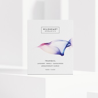
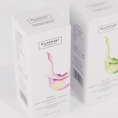
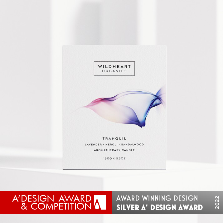
It’s rare among candle brands to insist on all organic ingredients, a point of difference we took to heart when tasked with packaging Wildheart’s precious olfactory experiences. The idea was to break into higher end retailers with a look that would stand up to the rare quality of the product.
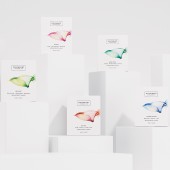
We created a packaging solution that was physically sturdy, yet visually delicate. Colors create a visual identity for 52 products across 5 ranges.
UNIQUE PROPERTIES / PROJECT DESCRIPTION:
The agency elevated Wildheart’s branding and product packaging design to reinforce its clean credentials, hero the divine aromas and create a premium lifestyle brand.
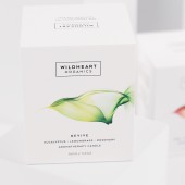
Very few candle brands use completely organic ingredients, we captured Wildheart’s point of difference and high quality throughout the packaging, visually and with tactile materials.
OPERATION / FLOW / INTERACTION:
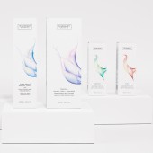
Boxes are crash lock bottoms with simple tuck in lids.
Core flute inners have die cut finger hole for ease of opening.
PROJECT DURATION AND LOCATION:
Project commenced in July 2018, Sydney Australia.
Project completed in April 2019, Sydney Australia.
Launched in UK in September 2019
FITS BEST INTO CATEGORY:
Packaging Design
|
PRODUCTION / REALIZATION TECHNOLOGY:
Printed CMYK on uncoated stock with spot UV details.
Boxes of various sizes with coreflute inners.
Separate label s printed for candle jars.
SPECIFICATIONS / TECHNICAL PROPERTIES:
There were a range of box sizes created. The material specification was uncoated off white stock, with a slight texture. Printed offset in CMYK with spot UV details on illustrations and brand mark. Inners were from white core flute. Labels printed single colour on satin finish self-adhesive stock.
52 SKU's, 5 product ranges
TAGS:
Candle packaging, Packaging for candles, premium packaging, luxury candle packaging
RESEARCH ABSTRACT:
On a functional note, the brand’s previous boxes weren’t holding up well in shipment. Depot created a packaging solution that was physically sturdy, yet visually delicate. A premium hand feel combines with light colors and ethereal illustrations that allude to the plant-based scents that dissipate into the air as the candle burns. Colors create a visual identity for 52 products across 5 ranges. The effect makes the organic claim legible, while creating a more polished, luxurious experience overall.
CHALLENGE:
The project timing was quite tight.
ADDED DATE:
2022-02-27 03:51:24
TEAM MEMBERS (2) :
Angela Spindler - Creative Director, designer, illustrator and Annie Dekker - Finished art, retouching, illustration colour/retouching
IMAGE CREDITS:
Angela Spindler, 2021.
|
| Visit the following page to learn more: https://www.wearedepot.com.au/portfolio |
|
| CLIENT/STUDIO/BRAND DETAILS |
 |
NAME:
Depot Creative
PROFILE:
Packaging Design that builds brands.
We’re specialists in our field, choosing to stick with what we do best without getting stuck in our ways. We focus on food, drinks, fragrance, beauty and wellness and lifestyle because a lifetime of being immersed in these categories is where our experience comes into its own. We team up with visionary clients because they value the difference we bring to the mix. We always challenge and seek out the difference to ensure our designs remain in the mind and heart of consumers.
We’re Depot, the packaging thinkers, creators and innovators.
|
|
|
| COMMENTS |
| Giulia Esposito |
Comment #15439 on December 28, 2022, 1:27 am |
|
I'm absolutely in awe of this design! The intricate details and thoughtful touches that have gone into this packaging design are remarkable. The colors are so vibrant and the design elements have been cleverly used to reflect the essence of the product. I'm also impressed by the fact that the packaging design is both aesthetically pleasing and highly functional. It's definitely a job well done! Congratulations to Angela Spindler for winning the A' Design Award for her work Wildheart Organics Aromatherapy Candles!
|
| Paul Williams |
Comment #64876 on January 4, 2023, 12:17 am |
|
The award-winning packaging design of Wildheart Organics is a true testament to the power of design. The brand's commitment to using all organic ingredients is clearly communicated through the use of delicate colors and ethereal illustrations, creating a visually stunning yet tactile package. The box is both physically sturdy, yet visually delicate, while the separate labels printed for the candle jars give the product a luxurious, polished finish. It is truly remarkable how Angela Spindler was able to create such an alluring and powerful packaging design within such a tight timeframe. Congratulations on winning the A' Design Award - Wildheart Organics is a masterpiece!
|
| Paul Phillips |
Comment #75822 on January 4, 2023, 5:29 am |
|
I'm absolutely in awe of this packaging design! Wildheart Organics has really set the bar for organic aromatherapy candles with their unique and high-quality design. The branding and packaging are incredibly well thought out and exude a strong sense of clean credentials and luxurious lifestyle. I particularly love the use of tactile materials, which really helps to enhance the overall experience of the product. This is a truly remarkable work and definitely deserves the A' Design Award. Well done!
|
| Elena Petrenko |
Comment #78921 on January 4, 2023, 7:08 am |
|
This award-winning work is a perfect blend of luxury and sustainability, creating a visually stunning and tactile packaging solution.
|
| Adam Harris |
Comment #86286 on January 4, 2023, 12:36 pm |
|
I am truly inspired by the Wildheart Organics packaging design. It is a testament to the power of good design to elevate a brand and draw attention to its exceptional quality. The use of tactile materials and light colors create a stunning visual identity for the product. Angela Spindler's team should be commended for their ingenuity in creating a package that is both physically sturdy and visually delicate. Additionally, the team managed to solve a functional issue with the tight project timing. This award-winning work is an inspiring example of how design can be used to create a unique and luxurious experience.
|
| Chloe Turner |
Comment #92272 on January 4, 2023, 7:00 pm |
|
I'm so impressed with this work! The packaging for Wildheart Organics is simply stunning and for an aromatherapy candle, it looks truly luxurious. The colors used throughout the packaging creates a visual identity that stands out from the competition and brings in a sense of sophistication. It's no wonder that this packaging was able to get into higher end retailers - it's simply beautiful! Kudos to the designer behind this masterpiece.
|
| Mark Allen |
Comment #94279 on January 4, 2023, 9:52 pm |
|
This fantastic packaging design is a beautiful combination of physical sturdiness and visual delicacy. The premium hand feel, light colors and ethereal illustrations create a luxurious experience that perfectly complement the rare quality of the product. The colors create a visual identity for the 52 products across 5 ranges, and the organic claim is easily legible. Congratulations on a job well done!
|
| Elisabeth Clark |
Comment #95120 on January 4, 2023, 11:25 pm |
|
I'm absolutely in awe of Angela Spindler's award-winning work with Wildheart Organics! Their packaging design is truly stunning and speaks to the quality of their product. It's so impressive that they insisted on using all organic ingredients, something that's very rare in the candle industry. The delicate colors and ethereal illustrations create a truly luxurious experience, making the organic claim very legible. I'm so glad that Angela Spindler was able to create a packaging solution that was both physically sturdy and visually delicate - it's a testament to their skill and dedication. Amazing work!
|
|
|
Did you like Angela Spindler's Packaging Design?
You will most likely enjoy other award winning packaging design as well.
Click here to view more Award Winning Packaging Design.
Did you like Wildheart Organics Aromatherapy Candles? Help us create a global awareness for good packaging design worldwide. Show your support for Angela Spindler, the creator of great packaging design by gifting them a nomination ticket so that we could promote more of their great packaging design works.
|
|

|
|
|
|
