Daan L Residential by An Zhi Zheng |
Home > Winners > #137396 |
 |
|
||||
| DESIGN DETAILS | |||||
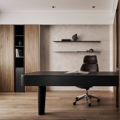
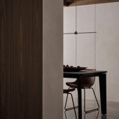
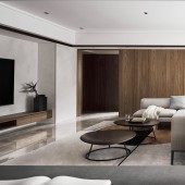
| DESIGN NAME: Daan L PRIMARY FUNCTION: Residential INSPIRATION: The homeowner has a busy work schedule and would like to has a relaxing space after work. Meanwhile, also expects a refined and high quality life. Often welcomes friends to visit and gather. Therefore, this project utilize the same materials consistently throughout the space to extend the overall sense of space without causing visual fatigue. UNIQUE PROPERTIES / PROJECT DESCRIPTION: Unlike the previous residential space, which had disorderly variations of cabinets, various materials, and furniture, the most important feature of this makeover is that organized the space utilizing a subtractive approach to make the space consistent as a whole. OPERATION / FLOW / INTERACTION: For the main TV wall, chose to apply an artistic coating in the same color as the rest of the walls but with a richer texture, so that the whole spatial consistency can be integrated while also defining the visual design of the main TV wall, instead of the usual approach of choosing a sharply contrasting color. THis project chose natural marble for the flooring, and leveraged the natural reflection of marble to add a little height to the originally low ceiling height of the house. For the wooden texture, specially chose a MOKU pattern and dark brown wood veneer, so that the space is more relaxed and resonant for the homeowner. PROJECT DURATION AND LOCATION: Jianguo N. Rd., Zhongshan Dist., Taipei City 104075, Taiwan (R.O.C.) FITS BEST INTO CATEGORY: Interior Space and Exhibition Design |
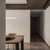
PRODUCTION / REALIZATION TECHNOLOGY: Because organized the space utilizing a subtractive approach. The superfluous material variations and the thickness of cabinets no longer exist, which greatly frees the eyes from visual chaos. In addition, this porject tried to use wood grain, artistic coating and the natural texture of the marble to decorate this space, without any human-made modeling. SPECIFICATIONS / TECHNICAL PROPERTIES: This space has 120 square meter. As the whole house is U-shaped, the corridor forms a natural channel along the layout, while the rest of the space was scattered in various areas, which easily made the overall space look smaller. Therefore, opened up the public area without dividing it through partitions, and let the natural corridor connect the position of each space, so that each space can be seen visually, increasing the overall visual sense of space. TAGS: Interior, Space, Residential, Modern, Art RESEARCH ABSTRACT: Indirect lighting for the overall lighting. The soft lighting can add gentle ambience to the space and give the homeowners a night mode in the evenings. Resident can rest in a relaxed environment after work away from the hustle and bustle of the city. CHALLENGE: The room area was specially replaced with a wooden floor to distinguish between public and private areas. For the design of the bed board, considered the Chinese Feng-Shui belief that one should not sleep under a beam and should not have a sharp angle facing the bed. Therefore, the bed board is specially shaped with wrapping wood veneer, avoiding the beams on the head of the bed and ensconcing it with a circular shape. Also utilized the space behind the head of the bed for indirect lighting, extending the overall design to provide a space that is not disturbed by too much light when the owner needs to rest. ADDED DATE: 2022-02-26 13:44:45 TEAM MEMBERS (2) : Behinddesign and Designer An Zhi, Zheng IMAGE CREDITS: Image #1: Photographer ANDY's Photography 2021 Image #2: Photographer ANDY's Photography 2021 Image #3: Photographer ANDY's Photography 2021 Image #4: Photographer ANDY's Photography 2021 Image #5: Photographer ANDY's Photography 2021 PATENTS/COPYRIGHTS: Behinddesign / An Zhi, Zheng |
||||
| Visit the following page to learn more: http://www.behinddesign.info/ | |||||
| AWARD DETAILS | |
 |
Daan L Residential by An Zhi Zheng is Winner in Interior Space and Exhibition Design Category, 2021 - 2022.· Read the interview with designer An Zhi Zheng for design Daan L here.· Press Members: Login or Register to request an exclusive interview with An Zhi Zheng. · Click here to register inorder to view the profile and other works by An Zhi Zheng. |
| SOCIAL |
| + Add to Likes / Favorites | Send to My Email | Comment | Testimonials | View Press-Release | Press Kit |
Did you like An Zhi Zheng's Interior Design?
You will most likely enjoy other award winning interior design as well.
Click here to view more Award Winning Interior Design.


