DESIGN NAME:
Dining Time
PRIMARY FUNCTION:
Restaurant
INSPIRATION:
The design concept started with a male watch, the design team extracted the gentlemanly lines and elegant color on the watch and combined it with the dining space, presenting a unique atmosphere of a European vintage restaurant. Different from the impression of chaotic hot pot restaurants, the first and second floors are clean, fresh, and bright, which is suitable for customers to enjoy a good time with their beloved or loved ones.
UNIQUE PROPERTIES / PROJECT DESCRIPTION:
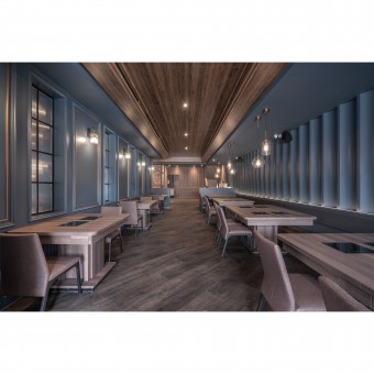
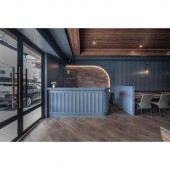
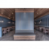
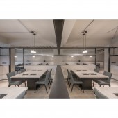
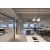
The design is derived from a gentleman watch, and the blue and gold create an elegant taste while the cultural stone and trim convey a vintage and classic feeling. The wave panels on the wall and the inward contraction of the ceiling, the curved lines of the counter, and the mood lighting strips create a picture of an English gentleman waiting for his lady in the waiting booth and symbolize the waiting time for the checkout. The field is divided symmetrically, and the design team used corrugated plates of different densities and different styles of chandeliers to create an asymmetrical design.
OPERATION / FLOW / INTERACTION:
The name (Dining Time), is derived from a watch, a scene, and a gentleman waiting for his lady. In the 357-square-meter space, the design team used colors, lines, and materials to create the impression of an elegant gentleman on the ground floor. The second floor continues the gentleman freshness, elegance, and brightness to present a comfortable dining space, and is also a blessing from the design team, hoping that customers can share a good time.
PROJECT DURATION AND LOCATION:
The project finished in September 2021 in Taiwan.
FITS BEST INTO CATEGORY:
Interior Space and Exhibition Design
|
PRODUCTION / REALIZATION TECHNOLOGY:
The original concept was based on a purple and gold watch. Considering that the project is a dining space, if purple was matched with yellow light, it would visually turn gray and reduce the customer's appetite. Therefore, after a series of communication on the color, the client decided to use blue to create a gentlemanly style. To make the hot pot restaurant more modern, the design team used small details to create an exquisite design. For example, multimedia equipment and air-conditioning are hidden inside the ceiling, and the partition wall can cover the columns and present design consistency.
SPECIFICATIONS / TECHNICAL PROPERTIES:
This 357-square-meter, two-story project is a renovation of a 30-year-old house with a total capacity of 110 people. The ground floor has a staff area, a self-service area, and a restroom; the second floor has three private rooms, a self-service area, and a restroom. The first floor has a height of 3.6 meters so that the bright impression of a gentleman's stance can show in the space. In response to the narrow space, the design team divided the route symmetrically with the ceiling level design to make the space feel more depth.
TAGS:
Hotpot, gentleman, blue, dessert, watch.
RESEARCH ABSTRACT:
On the ground floor, the design and style of the watches are used to create a dining space for gentlemen to wait for their ladies, while on the second floor, the story of the gentlemen invitation is continued to give the space a special meaning. The trim and rose gold lacquer present the elegance of a gentleman, and the high ceiling symbolizes the slender figure of a gentleman. The rhythmic corrugated plate is the rhythm of leather shoes, expecting a beautiful woman to go on an appointment.
CHALLENGE:
The first is that the original condition of the house is not a square pattern. If the design team makes a straight-line design in the space, it will highlight the skew. To eliminate this visual discrepancy, the design team used the slanting method on the flooring to give the space a square visual impression, and the actual angle and hemming method required more measurement and communication.
ADDED DATE:
2022-02-25 06:39:22
TEAM MEMBERS (1) :
Wei-Chen Lin
IMAGE CREDITS:
SJ Inter Design
|
