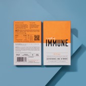
Leapfrog Remedies Immune Wellness Packaging by Mayk |
Home > Winners > #136936 |
 |
|
||||
| DESIGN DETAILS | |||||
| DESIGN NAME: Leapfrog Remedies Immune PRIMARY FUNCTION: Wellness Packaging INSPIRATION: The design / colour and branding was subliminally reminding the customer of the science & medicine within. The overarching design thread was inspired by French heritage apothecary brands. Maÿk looked to imbue the heritage of centuries old apothecary formulations alongside modern scientific research into a stylish contemporary on-the-go product. UNIQUE PROPERTIES / PROJECT DESCRIPTION: The brief was for the design of Leapfrog IMMUNE to be both distinct and vivid enough to engage curiosity in a crowded wellness marketplace but to also have a premium look and feel. The front of pack was intended to be bold, clean and uncluttered, allowing the word IMMUNE to capture the customers attention. The use of matte finish to the box and a gloss foil to IMMUNE would further draw the eye. The choice of a 50/50 orange/white colour split was a playful nod to traditional pill supplements. OPERATION / FLOW / INTERACTION: This project has been a collaborative journey between maÿk & Leapfrog Remedies. Over the course of 12 months, they evolved the formulation & design of Leapfrog IMMUNE from a liquid (dismissed as not portable enough) to a gummy (dismissed due to the high temperatures required during the manufacturing process which would destabilise the lactoferrin) to finally deciding on a chewable tablet. With each product pivot came fresh packaging concepts, including (but not restricted to): vintage style amber glass bottles, PET effervescent tablet tubes and biodegradable pouches. PROJECT DURATION AND LOCATION: Started in late 2019 and launched in August 2020 in London FITS BEST INTO CATEGORY: Packaging Design |
PRODUCTION / REALIZATION TECHNOLOGY: Designed exclusively using the Adobe Suite botht he branding and packaging were created in Illustrator whilst the internal booklet was created using InDesign. The packaging paper weights / finishes / styles were tested, much like a clothing designer would choose a fabric for a new dress. Some of the brands appraised included Arjowiggins, Keaykolour and Colorplan. Ultimately, the simplicity and timeless quality of Colorplan won. SPECIFICATIONS / TECHNICAL PROPERTIES: 75mm x 120mm x 20mm - similar in size to an iPhone - designed to be able to fit in a back pocket and or handbag for easy reach when needed. TAGS: Wellness, Bold, Contemporary, Typography, Texture RESEARCH ABSTRACT: - CHALLENGE: The major challenge was to create a brand and packaging that felt equally comfortable on a table at a dinner party as it is comfortable in a woman’s bathroom cosmetics cabinet surrounded by her premium beauty products. We needed to create something that was timeless, could draw the eye on shelf, have "feel appeal" and be recognisable from every side. ADDED DATE: 2022-02-24 15:57:13 TEAM MEMBERS (2) : Jon Wallhouse - Creative Director and Petros Spyrou - Photographer IMAGE CREDITS: Image #1-4: Petros Spyrou |
||||
| Visit the following page to learn more: https://leapfrogremedies.com | |||||
| AWARD DETAILS | |
 |
Leapfrog Remedies Immune Wellness Packaging by Mayk is Winner in Packaging Design Category, 2021 - 2022.· Read the interview with designer Mayk for design Leapfrog Remedies Immune here.· Press Members: Login or Register to request an exclusive interview with Mayk. · Click here to register inorder to view the profile and other works by Mayk. |
| SOCIAL |
| + Add to Likes / Favorites | Send to My Email | Comment | Testimonials | View Press-Release | Press Kit |
Did you like Mayk's Packaging Design?
You will most likely enjoy other award winning packaging design as well.
Click here to view more Award Winning Packaging Design.


