KGI Bank Website Redesign by Frog Singapore |
Home > Winners > #136784 |
 |
|
||||
| DESIGN DETAILS | |||||
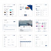
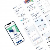
| DESIGN NAME: KGI Bank PRIMARY FUNCTION: Website Redesign INSPIRATION: Informative yet minimalistic. Professional yet dynamic. This is how the team began reimagining what a bank website should look like. Ultimately, the big question is how can we unify the corporate and retail experience to create a site that is nimble, simple, and smart. UNIQUE PROPERTIES / PROJECT DESCRIPTION: The site should not just be a platform for easy information, it should be about truly connecting with customers at every interaction. To do this, the site was redesigned to take customers on a journey to help them easily discover what they are looking for while emotionally engaging them through surprising micro animations that reinvents the common interaction. OPERATION / FLOW / INTERACTION: Simplifying the entire visual concept, the site was designed to help the customers feel relaxed by allowing them to slowly discover the different facets of the bank one at a time and layer by layer. Primed to be a digital companion for customers, strategically interspersed CTAs and easy access to commonly used tools are always nearby to encourage their next step. PROJECT DURATION AND LOCATION: The website was designed via online collaborative effort by team members from Singapore, Shanghai, and Taiwan across 9 weeks from 5th July 2021 to 10th September 2021 |
PRODUCTION / REALIZATION TECHNOLOGY: The user interface of this website was designed in Figma. SPECIFICATIONS / TECHNICAL PROPERTIES: Responsive mobile and desktop UI/UX design for a website which engages users and helps in discoverability of information. TAGS: User Experience, User Interface Design, Design System, Website, Responsive RESEARCH ABSTRACT: Following a template based approach, the team first defined the design direction by identifying shared visual principles between the corporate and retail experience. To further build on the content guidelines for the entire redesign, the team analysed the existing guidelines and best practices to develop the overall simplified visual concept and templates. CHALLENGE: Updating the existing design system, the biggest challenge came in redesigning a site that showcased information about four different subsidiaries in one. The challenge lies in finding the balance between providing enough context for customers while ensuring ease of use. With this, the team focused on enhancing navigation to the different subsidiary sections with subtle guidance for easy discovery. ADDED DATE: 2022-02-24 06:20:19 TEAM MEMBERS (11) : Executive Creative Director: Ignatius Ong, Executive Program Director: Chaz Lu, Program Director: Lucas Chen, Project Creative Lead: Emmanuelle Hu Ying, Program Manager: Sandy Wang, Visual Designer: Anna Tsai and Qingbei Wang, UX Designer: Sue Su , UXUI Designer: Emma Wang, UX Design Assistant: Elvin Lu, Design Technologist: Sid Huang and Please note: Members in this project team are from frog design studios in Singapore and Shanghai. IMAGE CREDITS: frog Singapore, 2022 |
||||
| Visit the following page to learn more: http://www.kgibank.com.tw | |||||
| AWARD DETAILS | |
 |
Kgi Bank Website Redesign by Frog Singapore is Winner in Website and Web Design Category, 2021 - 2022.· Read the interview with designer Frog Singapore for design KGI Bank here.· Press Members: Login or Register to request an exclusive interview with Frog Singapore. · Click here to register inorder to view the profile and other works by Frog Singapore. |
| SOCIAL |
| + Add to Likes / Favorites | Send to My Email | Comment | Testimonials | View Press-Release | Press Kit |
Did you like Frog Singapore's Web Design?
You will most likely enjoy other award winning web design as well.
Click here to view more Award Winning Web Design.


