DESIGN NAME:
Serenity
PRIMARY FUNCTION:
Residence
INSPIRATION:
The female client works in a high-pressure operating room and likes to create a sense of ritual in her life; the male client owns a restaurant and likes unique and trendy products. This young couple needs a warm, relaxing, and stylish home to release their stress. Therefore, the designer designed the foyer as a showcase of fine goods, which can become a display area for the man's favorite shoes and a gallery of silk scarves, and also create a sense of ceremony for the woman favorite. Paved the whole space with low saturation colors to create a relaxed and serene feeling.
UNIQUE PROPERTIES / PROJECT DESCRIPTION:
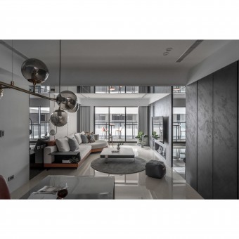
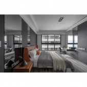
In order to create the most comfortable residence, the designer renovated the 2.3-meter beam with a gray mirror design, so that the visual sense of the space can be magnified and presented. This modification fully brings the space with a bright and airy atmosphere, further leading the family to break away from the tight and tired work, allowing them to relax.
OPERATION / FLOW / INTERACTION:
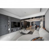
As the clients of this project are a young couple who love to collect various items, the designer deliberately planned showcases in the space to display the clients items. This kind of planning not only enhances the texture of the space and creates a personal style but also reveals a new visual with multiple elements.
PROJECT DURATION AND LOCATION:
The project finished in November 2021 in Taiwan.
FITS BEST INTO CATEGORY:
Interior Space and Exhibition Design
|
PRODUCTION / REALIZATION TECHNOLOGY:
In order to create a different texture and taste in a space without too much color, the designer, who is keenly observant and attentive to details, chose to use technological wood grain panels on the walls to give the space a subtle wood grain embellishment under such a simple and plain space. On the other hand, the designer chose to reduce the use of paint is to present the natural atmosphere of the material themselves, which blends perfectly with the atmosphere of the space and creates the most gentle and pleasant home.
SPECIFICATIONS / TECHNICAL PROPERTIES:
This project has 105 square meters of space, with 3 rooms, a dining room, and a living room. In such a spacious space, the designer used creativity to clearly delineate the public and private areas of the space and integrate the space horizontally and vertically, allowing natural light to shine into the house through good lighting design, and further shaping a quiet and relaxing home with a smooth and harmonious traffic flow.
TAGS:
Reduced stress, low saturation, gray mirror, comfort, relaxation.
RESEARCH ABSTRACT:
To provide the most relaxing and comfortable feeling for the clients who often work under high pressure, the designer used black, white, and gray and clever design ideas to create a house full of calmness. In addition, the designer also focuses on the details, so the designer has not only through the combination of various materials and objects to show a unique feeling, and further lead the clients to jump out of the tired, nervous mood.
CHALLENGE:
This project was originally 4 rooms, a dining room, and a living room layout, one room was removed at the client request and converted into a custom-made dressing room for the bedroom. In addition, the designer used a punch board to create a shoe cabinet in the entrance, with a switch box behind it. To maintain the visual appearance, the designer used a hidden design to wrap around the cabinet, which perfectly makes the entrance area show a consistent and harmonious texture.
ADDED DATE:
2022-02-24 05:46:19
TEAM MEMBERS (2) :
CHUN-HUNG CHEN, CHIEN-HSIUNG HUANG and
IMAGE CREDITS:
No.2 design
|


