DESIGN NAME:
Zhongxin International City
PRIMARY FUNCTION:
Interior Design
INSPIRATION:
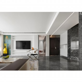
Although the perception of space and colors varies according to different people, the black and white background often provides a strong sense of space. Inspired by the overlapped space of Chinese gardens, the project is designed in a modern approach. Also, a black and white background is adopted to enhance spaciousness, with a touch of high-saturation colors, so as to create vitality while retaining well-balancedbeauty.
UNIQUE PROPERTIES / PROJECT DESCRIPTION:
The project provides a decoration scheme for a family of three. It adopts an innovative space design, which integrates the public areas and removes the doors to create a living space with a sense of transparency and efficient circulation. The main tone of black and white not only looks clear, but also highlights other colored embellishments, therefore enriching the overall visual effect and avoiding monotony.
OPERATION / FLOW / INTERACTION:
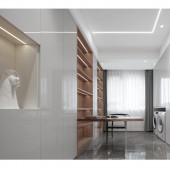
The unit layout was overly square, whose functional areas were too simple and inflexible. As a result, each space was independent without reasonable circulation. After the redesign, the door-free design and the integrated public areas significantly reduce the barriers to the vision, thus broadening the overall view and optimizing the circulation. Besides, the configuration of ample cupboards facilitates the sorting and storage of various items to keep the house tidy.
PROJECT DURATION AND LOCATION:
The project was launched in Jinan, China, in May 2021.
The preliminary work was completed in September 2021.
The interiordecoration was completed and the project was delivered to the owners in November 2021.
FITS BEST INTO CATEGORY:
Interior Space and Exhibition Design
|
PRODUCTION / REALIZATION TECHNOLOGY:
Walls: natural marble and slate
The ground of the activity area: CIMIC tiles
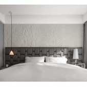
Bedroom ground: a solid wood floor
Bathroom ground and walls: Yuanjin gray marble
Sofas: a carbon steel structure, saddle leather, top layer calf leather and 18K gold-plated stainless steel
Tea tables: imported Pandora luxury stone and 18K gold-plated stainless steel
Dining tables: imported slate and acrylic
Desks: Japanese oak and acrylic
SPECIFICATIONS / TECHNICAL PROPERTIES:
170㎡
TAGS:
quiet, simple and classy
RESEARCH ABSTRACT:
Facing the increasing daily necessities, home decoration for long-term living tends to be caught in a dilemma of sacrificing the design style or storage space. In the project design, the designers drew on rich experience to balance the spaciousness and simplicity with the storage and furnishings by integrating the space and using cupboards as partitions, thereby providing a pure and minimal life experience for dwellers in thelong run.
CHALLENGE:
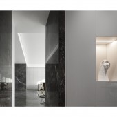
The most difficult part in this design was transforming the unite layout whose original walls were mostly non-removable. Undoubtedly, the excessively square layout rendered the unit dull and lifeless. The small kitchen and dining room side by side seriously impaired the view and the overall style. By transforming the corridors, adding cupboards, and uniformly veneering with natural gray marble, the designers have turned the unit into a space with a harmonious style and a richersense of layer.
ADDED DATE:
2022-02-24 03:32:06
TEAM MEMBERS (1) :
IMAGE CREDITS:
Taowujia Group, 2021.
|


