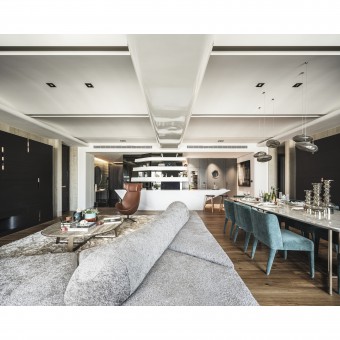
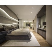
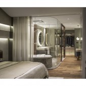
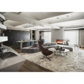
Anchor and Sail Residential House by Jerry Hsu |
Home > Winners > #136583 |
| CLIENT/STUDIO/BRAND DETAILS | |
 |
NAME: HHNL Architecture & Interior Design PROFILE: HHNL is a well-established innovative design firm, founded at 2006. We offer a full spectrum of design services, including architectural and interior design. We have experience on a wide variety of projects including residential, high-end amenity, office, exhibition space, retail and hospitality, among others. We also provide services for complete project coordination, including areas such as lighting, landscape, graphic design, and branding. This expertise in a wide array of projects combined with our experience with interdisciplinary collaborations fuels our design creativity. We function in a studio environment, comprised of a close-knit team which employs clear and direct communication with our clients. This working methodology allows us to execute each design precisely and efficiently. Additionally, we work with professionals in many diverse areas, bringing design context that enriches the space. We embrace a spectrum of design styles, while bringing it to life through HHNL's high attention to detail. |
| AWARD DETAILS | |
 |
Anchor and Sail Residential House by Jerry Hsu is Winner in Interior Space and Exhibition Design Category, 2021 - 2022.· Read the interview with designer Jerry Hsu for design Anchor and Sail here.· Press Members: Login or Register to request an exclusive interview with Jerry Hsu. · Click here to register inorder to view the profile and other works by Jerry Hsu. |
| SOCIAL |
| + Add to Likes / Favorites | Send to My Email | Comment | Testimonials | View Press-Release | Press Kit |
Did you like Jerry Hsu's Interior Design?
You will most likely enjoy other award winning interior design as well.
Click here to view more Award Winning Interior Design.


