DESIGN NAME:
Grasp the Light
PRIMARY FUNCTION:
Residence
INSPIRATION:
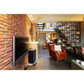
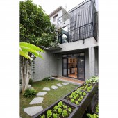
The 40-year-old house is redecorated with a washed finish, granite, and architectural concrete on the exterior, with red bricks, cedar, and cypress paved on the inside. Meanwhile, steel frames and glass materials are also used to create a Zen-like minimal style. Since the structure is narrow and long, which gives disadvantages of gloomy and poor ventilation conditions, the designer opened up the ceiling to draw natural lightings to increase brightness at any time of the day. While users can enjoy the sky scenery, the adjustments have also increased transparency and ventilation for the living space.
UNIQUE PROPERTIES / PROJECT DESCRIPTION:
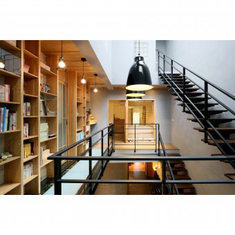
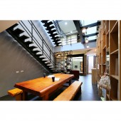
The features of this project include the glass-made rooftop that solved the initial lack-of-brightness issue and the hallway set up on the high second floor as a connection to the villa next door, where relatives of the users live in. At the same time, the cathedral ceilings on the 2nd floor are placed with a book wall made of solid wood; it not only draws attention but is also extended towards the first floor to pair with the steel frames and glass treads. Overall delivers high transparency and functionality by eliminating the pressure brought by the original and traditional stairs.
OPERATION / FLOW / INTERACTION:
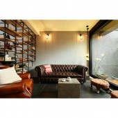
The designer first applied transparent materials and an open-end method to improve the initial issues of the old building, giving the household of four a relaxing and rustic living environment. Meanwhile, since the space is narrow and long, the hollowed display-type screen next to the living room staircase is made of ironware and wood materials to maintain a sense of transparency. The elegant-styled interior is also equipped with cabinets that reach the cathedral ceilings, allowing the user, who likes to read and collect books, to store and display the personal collections.
PROJECT DURATION AND LOCATION:
The project finished in May 2018 in Taiwan.
FITS BEST INTO CATEGORY:
Interior Space and Exhibition Design
|
PRODUCTION / REALIZATION TECHNOLOGY:
Cedar, cypress, steel frames, granites, red bricks, and glass materials. While the glass mask on the roof has increased transparency, it has also occupied some space height. However, the designer set up cabinets on the two sides to maximize the overall space efficiency; the cabinets replaced typical partitions while dividing each area and are paired with ironware and glass-made bricks to increase transparency. Furthermore, a hallway is designed to allow users to easily visit their relatives who live next door, further increasing interaction between family members.
SPECIFICATIONS / TECHNICAL PROPERTIES:
The actual size of the designed space is 75 pings, including: The 30-ping first floor (an entryway, a living room, a dining room, a kitchen, a study, a front yard, and a backyard). The 30-ping second floor (the leisure and workout area, the master bedroom, the master bathroom, a dressing room, and a working space). The 15-ping third floor (the secondary bedroom and a working space).
TAGS:
New purpose for old residences, long and narrow structure improvements, zen and simple, strengthen structural safety, transparent lighting residences.
RESEARCH ABSTRACT:
The house client, an engineer with two daughters, hoped the 40-year-old building could be redecorated to give the family a more suitable living environment. Hence, the designer designed the space in a low-key manner; architectural concrete and washed finish in greyscales are applied on the exterior, while the solid-wood-made doors have given the space a heart-warming feeling. Whilst a farming area is set up in the garden, the configuration of the 2.5th floor has satisfied all members expectations for living.
CHALLENGE:
The designer has boldly applied transparent materials on the roof to solve the poor ventilation and lighting conditions of the narrow and long old house. At the same time, stable and solid building materials are also applied to the exterior and structure to increase safety while creating an aesthetic sense. Moreover, gardening scenery is designed at the front yard; the greenery is further transformed into a part of the interior to give the residence a characteristics touch.
ADDED DATE:
2022-02-23 03:44:54
TEAM MEMBERS (1) :
HONG-YU OU, YU-JCHIAO CHUNG
IMAGE CREDITS:
OY Interior Design
|


