DESIGN NAME:
Jian Sushi
PRIMARY FUNCTION:
Restaurant
INSPIRATION:
This project is a Japanese restaurant, and its owner is a professional craftsman who loves to collect antiques and art pieces. Hence, the designer focused on creating a space that can perfectly combine artwork with cuisines while delivering the essence of the Japanese spirit in a modern and aesthetic way.
UNIQUE PROPERTIES / PROJECT DESCRIPTION:
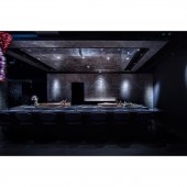
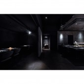
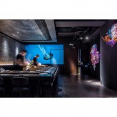
When one arrives at the dining area, the theme of the space comes clear suddenly. The black-grey leading tonal emits a steady vibe and highlights the directions of the lightings, which are all pointed towards various art pieces and cuisines. These effects arent all built up through visual experiences but are also created by hearing senses. Specially set up numerous absorptive materials to avoid sounds being spread out or diffracted. Art decorations are placed behind the itamae as symbols of the beautiful creatures that swim along with the movements and sounds of the sea.
OPERATION / FLOW / INTERACTION:
To the client a neat operational counter is necessary to give convenience when checking out. Hence, an itamae area in line with ergonomics and the traffic flow is specially constructed, embodying the essence of the client traditional Japanese craftsman spirit.
As for customers, a push door is set up at the VIP area to increase privacy; the precise lighting arrangements have also given guidance and directions towards the art pieces and cuisines.
PROJECT DURATION AND LOCATION:
The project finished in September 2021 in Taiwan.
FITS BEST INTO CATEGORY:
Interior Space and Exhibition Design
|
PRODUCTION / REALIZATION TECHNOLOGY:
Architectural concrete (symbolizing the client insist on using natural ingredients without being processed)
Yakisugi bans (Japanese traditional building material)
Rusted ironware (natural processing methods are used to deal with the rustiness instead of using organic protection coats)
Non-formaldehyde and non-VOC cement paints
Metal-imitating tiles
Absorptive materials (prevent sounds from being spread out or diffracted)
SPECIFICATIONS / TECHNICAL PROPERTIES:
The 135-square-meter space (around 40 pings) is equipped with a dining area, a VIP room, an itamae, a pantry, a kitchen, a hand-washing area, and a bathroom.
TAGS:
Japanese restaurant, craftsman spirit, modern Japanese aesthetic, Japanese style, artistic restaurants.
RESEARCH ABSTRACT:
The overall is decorated with blacks and greys, while dark yakisugi bans, rough architectural concrete, and rust oxidated ironware are used to create a simple and peaceful spatial feeling. While equipped with a consistent visual experience, the client collectibles are used as the main decorations of the space. Less is more would be the most representative concept for this project; overmuch elements are eliminated to highlight the main roles, cuisines and art strongly.
CHALLENGE:
Vision wise, how to create a personal and steady spatial feeling within an open-end space. Solution: Representative building materials and lighting are set up in the long hallway of the entrance. The open-end space used black and grey colors as divisions while lightings are pointed towards each private space direction. Sound-wise, The echoing sounds are prevented by setting up absorptive materials. To create rough yet textured architectural concrete that embodies the main concept of the space, several experiments have progressed to achieve the perfect balance between the concrete and the cement.
ADDED DATE:
2022-02-22 03:53:47
TEAM MEMBERS (1) :
Wu-Su Interior Design, Chun-Yu Chang
IMAGE CREDITS:
Wu-Su Interior Design
|


