The Hyatt Residence House by Li Lang |
Home > Winners > #136039 |
 |
|
||||
| DESIGN DETAILS | |||||
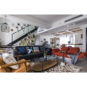
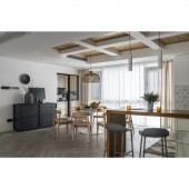
| DESIGN NAME: The Hyatt Residence PRIMARY FUNCTION: House INSPIRATION: Starting with the requirement,design team deeply think about the best way for different ages,make the design can reasonably allocate spaces for each family member, activities and storage,at the same time to meet the needs of the elderly. In addition to various rigid demands, it should also be a more functionally flexible space suitable for diverse group activities with copious natural lighting in each corner. UNIQUE PROPERTIES / PROJECT DESCRIPTION: This project maximally meets the different needs of different family members, letting them live with each other while have their own relatively independent spaces. It is suitable for the aging life in the next 20 years, as well as satisfies various demands of family members at different ages. Meanwhile, the design team break the original separate three-storey pattern to create rich spatial layers through the floor design with different shapes and sizes which is extending in multiple directions. OPERATION / FLOW / INTERACTION: The design team dismantled the existed concrete stair to get the elevator installed without a hitch, making room for lobby and storage area. In consideration of usage frequency, we added a stair in the living room to connect the first and second floor.By turning staircase into elevator room, the design makes the elevator’s entrance space as large as possible. The elevator room on the first floor is double-functioned as a hallway, where the family members can store many goods and change their shoes. Partial high ceilings make the whole living space more visually interesting. The balcony on the first floor is also relatively large. We created a separate area with empty space above, to be double-functioned as both an indoor garden and a secondary private space for male family members to smoke and chat. The original house type did not include the living room on second floor. It was completed by building boards above the balcony on the first floor during the later period.This area is just located above the center of the patio in the leisure area on the first floor. PROJECT DURATION AND LOCATION: The project started in March 2020 in Changsha and finished in January 2021 in Changsha. FITS BEST INTO CATEGORY: Interior Space and Exhibition Design |
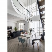
PRODUCTION / REALIZATION TECHNOLOGY: - SPECIFICATIONS / TECHNICAL PROPERTIES: The project covers a total of 360 square meters TAGS: Interior, Design, House, Mix and match style RESEARCH ABSTRACT: The design team dismantled the existed concrete stair to get the elevator installed without a hitch, making room for lobby and storage area. In consideration of usage frequency, we added a stair in the living room to connect the first and second floor. The family members walk up and down the stair between the first and second floors more often than go to the third floor. We dismantled the whole concrete stair, and added a stair into the living room to connect the first and second floors, so as to reduce the volume of stair. By turning staircase into elevator room, the design makes the elevator’s entrance space as large as possible. The elevator room on the first floor is double-functioned as a hallway, where the family members can store many goods and change their shoes. Meanwhile, a split-level structure is built with different proportions of each floor. Partial high ceilings make the whole living space more visually interesting. The elevator room on the third floor is connected with sunlight room and tatami study room as a whole, serving as one of the secondary private spaces. The center of the home should be the most interactive and comfortable area rather than a TV-watching area, so we divided the living room into two spaces—one is for the regular TV area, which is less emphasized, and the other is for the leisure area centered a long desk. On the top of leisure area, we built a curved patio ceiling to make the interaction between upper and lower floors with more fun in daily life, and to avoid this duplex house becoming two separate flat floor spaces. The balcony on the first floor is also relatively large. We created a separate area with empty space above, to be double-functioned as both an indoor garden and a secondary private space for male family members to smoke and chat. The original house type did not include the living room on second floor. It was completed by building boards above the balcony on the first floor during the later period.This area is just located above the center of the patio in the leisure area on the first floor. It’s another space for group activities besides the living room. It makes the family members’ interaction or recreation available without going downstairs. CHALLENGE: The design of this project maximally meets the different needs of different family members, letting them live with each other while have their own relatively independent spaces. It is suitable for the aging life in the next 10-20 years, as well as satisfies various demands of family members at different ages. Meanwhile, we break the original separate three-storey pattern to create rich spatial layers through the floor design with different shapes and sizes which is extending in multiple directions. On the basis of existed space structure, several primary and secondary spaces are created by taking advantage of the floor height. For furniture and decoration, we choose multi-color and soft fabrics, paying attention to the comfort and humanized structures and shapes, mixing up modern, retro and national classic styles. To add vitality and more livable atmosphere into the space, we avoid unit furniture intentionally, also allowing for future flexible redecoration. ADDED DATE: 2022-02-17 11:15:46 TEAM MEMBERS (1) : Li Lang,Chen Wenhua IMAGE CREDITS: Li Lang, 2021. |
||||
| Visit the following page to learn more: http://m.fancycs.com | |||||
| AWARD DETAILS | |
 |
The Hyatt Residence House by Li Lang is Winner in Interior Space and Exhibition Design Category, 2021 - 2022.· Read the interview with designer Li Lang for design The Hyatt Residence here.· Press Members: Login or Register to request an exclusive interview with Li Lang. · Click here to register inorder to view the profile and other works by Li Lang. |
| SOCIAL |
| + Add to Likes / Favorites | Send to My Email | Comment | Testimonials | View Press-Release | Press Kit |
Did you like Li Lang's Interior Design?
You will most likely enjoy other award winning interior design as well.
Click here to view more Award Winning Interior Design.


