Chasing Light Showroom by AD Architecture |
Home > Winners > #135973 |
 |
|
||||
| DESIGN DETAILS | |||||
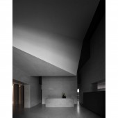
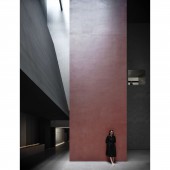
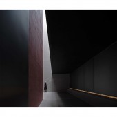
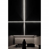
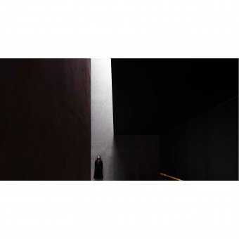
| DESIGN NAME: Chasing Light PRIMARY FUNCTION: Showroom INSPIRATION: Based on the core values of the ceramic tile brand with a history of 25 years, the project adopts the design logic that meets the demands of contemporary and future exploration, and shows respect to the brand's culture and core. The design team dug into the philosophy that respects nature and values a plain aesthetic. Through architectural space and light, the designers expressed their understanding of the ceramic tile products with a confident attitude. UNIQUE PROPERTIES / PROJECT DESCRIPTION: The product display space continues the overall design logic. To solve the problem of exhibition, ceramic tile products are divided into four categories, and are showcased in a pure manner on the horizontal and vertical surfaces within the space. With the interaction of light and geometric forms, and based on architectural aesthetics, the design expresses the confidence of the space and highlights the high-end products. OPERATION / FLOW / INTERACTION: The reception lobby breaks the original high and closed space, lowers the height of the ceiling, and creates interesting forms and a sense of strength, which visually extends the interior surfaces, enriches the spatial layers and effectively removes the oppressive feeling brought by closed space. The design displays the brand's image in an interactive manner, and creates connection between the 12 square columns and the brand. Several transitional spaces are inserted to link spatial nodes. PROJECT DURATION AND LOCATION: Start time: 2021.08 Completion time: 2021.11 Location: Foshan, Guangdong Province FITS BEST INTO CATEGORY: Interior Space and Exhibition Design |
PRODUCTION / REALIZATION TECHNOLOGY: The geometric form and scale of the space highlight the large size of sintered stones. Complemented by light, the textures of natural sintered stones are strengthened. The tranquil light, powerful forms and natural tactile experience are intriguing, evoking various emotions and thinking. Main materials: sintered stone panel, artistic paint, stainless steel, acrylic SPECIFICATIONS / TECHNICAL PROPERTIES: Building area:890 square meters Type:Showroom TAGS: AD ARCHITECTURE, Xie Peihe, plain aesthetics, light & geometric forms, corporate headquarters, brand display RESEARCH ABSTRACT: The design breaks the homogeneous design of conventional showrooms and ways of product display, and enables products to resonate with the space, nature, people and time. It's a bold exploration of showroom design in China's ceramics sector. By releasing the column networks of the space, the project creates a free, relaxing spatial atmosphere and well-organized circulation route, allowing visitors to experience all products and participate in every spatial node by following the set circulation. CHALLENGE: Conventional showrooms face two common problems. First, the conventional spatial pattern restricts products to expressing themselves. Second, unreasonable ways of product display make the space disorderly, and do not well show the strengths of products, thereby lowering buyers' shopping desires. There are 38 types of sintered stone panels, which can be used in 54 different ways in various spaces. To efficiently display the diversified uses of such a variety of products posed a big challenge. ADDED DATE: 2022-02-17 02:23:20 TEAM MEMBERS (2) : Chief designer:Xie Peihe and Furnishings:AD ARCHITECTURE IMAGE CREDITS: Ouyang Yun |
||||
| Visit the following page to learn more: http://reurl.cc/2DlMGE | |||||
| AWARD DETAILS | |
 |
Chasing Light Showroom by Ad Architecture is Winner in Interior Space and Exhibition Design Category, 2021 - 2022.· Read the interview with designer AD Architecture for design Chasing Light here.· Press Members: Login or Register to request an exclusive interview with AD Architecture. · Click here to register inorder to view the profile and other works by AD Architecture. |
| SOCIAL |
| + Add to Likes / Favorites | Send to My Email | Comment | Testimonials | View Press-Release | Press Kit |
Did you like Ad Architecture's Interior Design?
You will most likely enjoy other award winning interior design as well.
Click here to view more Award Winning Interior Design.


