ZENustas Hair Salon by Lorena Antea Caruana and Naoki Watanabe |
Home > Winners > #135762 |
 |
|
||||
| DESIGN DETAILS | |||||
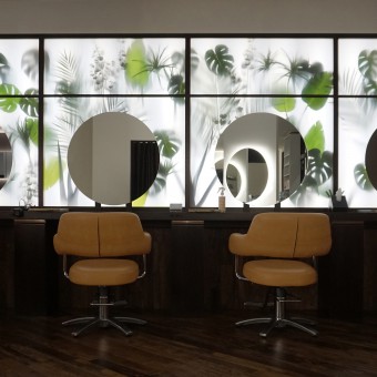
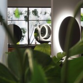
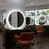
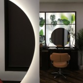
| DESIGN NAME: ZENustas PRIMARY FUNCTION: Hair Salon INSPIRATION: ZENustas is a word composed by merging the Japanese word Zen, meaning All, with the Latin word Venustas, the word for Beauty. The space aims to celebrate various forms of beauty, from natural one, proper of the Zen culture, to human-made beauty. The inclusive space is composed of Eastern and Western Architectural languages that synergistically shape the Interiors shaping a vibrant but still relaxing space. UNIQUE PROPERTIES / PROJECT DESCRIPTION: Yaizu is a town located near Mount Fuji in Japan. Here, the Natural space bursts into the Urban one defining highly suggestive scenarios. Similarly, in the Beauty Salon, Nature is brought into the space adding an iconic touch to the interiors. The backlit feature wall in polycarbonate is a contemporary interpretation of the traditional Japanese rice paper facades. This wall, hosting dimensional plants, is also a tribute to the traditional Japanese painting, setting a bold contrast between figure and background. OPERATION / FLOW / INTERACTION: ZENustas Hair Salon's design reflects a holistic approach. The wooden floor texture orientation creates a more intuitive customer journey that, from the entrance, naturally leads the customer towards the hairdressing stations. The wooden floor texture settles with the direction of the freestanding vertical short walls, providing consistency to the space. These oriented walls serve different purposes: increasing the number of available stations by optimizing the use of the space and, through the oriented mirrors, providing customers with the possibility of looking at the surrounding without leaving their chairs. PROJECT DURATION AND LOCATION: ZENustas Hair Salon is located in Yaizu, in proximity of the Mount Fuji in Japan. The project lasted 3 months while the construction phase lasted 7 days only. FITS BEST INTO CATEGORY: Interior Space and Exhibition Design |
PRODUCTION / REALIZATION TECHNOLOGY: The Hair Salon reflects a simple shape language where only a few materials compose the space, reaching the essential. The construction processes have been reduced by using standardized furniture and repeated simple bespoke elements in natural materials, while the whole renovation has been completed in 7 days. The wall with backlit panels in polycarbonate is the standing out feature element, the more expressive and articulated-looking component of the space. This wall aims to improve the light exposure to the customers seating in front of the mirror, defining intense and diffuse lighting. SPECIFICATIONS / TECHNICAL PROPERTIES: The 80 square meters space is mainly composed of two materials: MDF with a Dark wood finish and White washable wallpaper. By defining a horizontal datum line at the height of the tables, the two materials separate the lower from the upper part of the space providing a simple and yet contemporary look to the space. LED lighting used in the store increases efficiency while reducing the costs and the dimmable lights support the energy saving by interacting with the daylight. TAGS: japanese interiors, japalian, zen-ustas, hi-dea interiors, italian japanese design, japan hair salon RESEARCH ABSTRACT: Taking inspiration from the natural surroundings, the Beauty Salon aims to reflect on the idea of Threshold in Japanese traditional architecture: the space between outside and inside. In this space, the Threshold is represented by the feature wall with nature and backlit panels. Located to be visible from the outside, the feature wall invites the customers to access the space to explore the new functions. CHALLENGE: A challenging point of the design has been understanding the relevant architectural elements of the Japanese tradition and translate them into a space with a contemporary look and feel and destination. The use of the oriented short walls, coming from the Western tradition produces an almost circular customer flow, enriching the straightness of accesses and paths so typical of the Japanese tradition. The rounded shape language, loaned by the Italian architectural tradition completes the straight-looking pure geometry typical of this area, while providing surprising touchpoints. ADDED DATE: 2022-02-14 02:20:49 TEAM MEMBERS (2) : Lead Architect: Lorena Antea Caruana and Lead Local Architect: Naoki Watanabe IMAGE CREDITS: Image #No.1: Lorena Antea Caruana (Photo credits / Architect) Image #No.2: Lorena Antea Caruana (Photo credits / Architect) Image #No.3: Lorena Antea Caruana (Photo credits / Architect) Image #No.4: Lorena Antea Caruana (Photo credits / Architect) Image #No.4: Lorena Antea Caruana (Photo credits / Architect) |
||||
| Visit the following page to learn more: https://hi-dea.com/portfolio/hair-salon- |
|||||
| AWARD DETAILS | |
 |
Zenustas Hair Salon by Lorena Antea Caruana and Naoki Watanabe is Winner in Interior Space and Exhibition Design Category, 2021 - 2022.· Press Members: Login or Register to request an exclusive interview with Lorena Antea Caruana and Naoki Watanabe. · Click here to register inorder to view the profile and other works by Lorena Antea Caruana and Naoki Watanabe. |
| SOCIAL |
| + Add to Likes / Favorites | Send to My Email | Comment | Testimonials | View Press-Release | Press Kit |
| COMMENTS | ||||||||||||
|
||||||||||||


