From O to X Office by Chi-Wei Pai |
Home > Winners > #134140 |
 |
|
||||
| DESIGN DETAILS | |||||
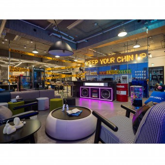
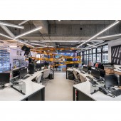
| DESIGN NAME: From O to X PRIMARY FUNCTION: Office INSPIRATION: The brand's logo with an X over an O, symbolizes combination, breakthrough, and innovation based on the origin, the true self. The brand's main concept is to break the fashion stereotype and conventional images of how one should wear. Thus, the designer takes the idea of "original" into consideration, forming a minimalist environment with shades of black and white. UNIQUE PROPERTIES / PROJECT DESCRIPTION: Urban aesthetics, street fashion, contemporary simplicity and modern atmosphere; with neon lights enlightens the industrial-styled office, the comfortable collaborative space not only becomes the best environment where works are done, but also somewhere one gets to push the limits, be creative and think outside the box. OPERATION / FLOW / INTERACTION: According to different timing and needs, people can quickly transition between different environments, scenarios, and emotion, boosting diverse creativity to the working process. Without use of traditional workplace partitions, ventilation and lighting can travel well to every corner of the space. PROJECT DURATION AND LOCATION: This project is finished in January 2022 in Taipei City, Taiwan. FITS BEST INTO CATEGORY: Interior Space and Exhibition Design |
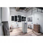
PRODUCTION / REALIZATION TECHNOLOGY: The industrial environment with exposed pipes on the ceiling, added some chic vibe through use of metallic materials, contributing to a modern concise style of the working space. The layout is open-plan, spacious, airy, and bright with a great amount of natural lighting, dividing the whole space into display area, photo studio, meeting room, rest area and flagship exhibition. SPECIFICATIONS / TECHNICAL PROPERTIES: This project is 602 square meters. TAGS: Interior Design, Office, Cyberpunk, Modern, Street RESEARCH ABSTRACT: In addition to a rather open layout, neon lights, selective furniture and items, and metallic materials are the three main elements to interpret the brand image with more details. While inspiring everyone, the interior decoration sends a clear message of the brand's visual identity, catching customer's attention. With lighting straps applied in the area where the staffs' seats are fixed, the lighting is well distributed. CHALLENGE: With different selected items and furniture, one can see the designer is trying to create different kinds of environment for different types of conversations. The space can appear relaxed, serious, private or open to everyone. In addition, with use of metal materials, the space can be adjusted with flexibility of the reusable and convertible elements, echoing with the brand's idea of constant progression. ADDED DATE: 2021-12-28 05:51:16 TEAM MEMBERS (1) : IMAGE CREDITS: Example: Image #1-5: Photographer Guan-Yu Hou, From O to X, 2022. |
||||
| Visit the following page to learn more: http://paishiinteriordesign.com/ | |||||
| AWARD DETAILS | |
 |
From O to X Office by Chi-Wei Pai is Winner in Interior Space and Exhibition Design Category, 2021 - 2022.· Read the interview with designer Chi-Wei Pai for design From O to X here.· Press Members: Login or Register to request an exclusive interview with Chi-Wei Pai. · Click here to register inorder to view the profile and other works by Chi-Wei Pai. |
| SOCIAL |
| + Add to Likes / Favorites | Send to My Email | Comment | Testimonials | View Press-Release | Press Kit |
Did you like Chi-Wei Pai's Interior Design?
You will most likely enjoy other award winning interior design as well.
Click here to view more Award Winning Interior Design.


