Into the Ink Residence by Jia Ru Chen |
Home > Winners > #134036 |
 |
|
||||
| DESIGN DETAILS | |||||
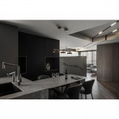
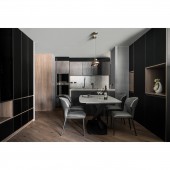
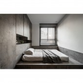
| DESIGN NAME: Into the Ink PRIMARY FUNCTION: Residence INSPIRATION: Instead of lowering the ceiling to adapt to the original situation, the designer decided to use black-white lines with embedded lighting design that run through the beams of the common area. It not only solves the overwhelming atmosphere caused by the lower beams above, it also serves as a hint to guide the residents along the flow, improving the spatial aesthetics with indirect lighting. UNIQUE PROPERTIES / PROJECT DESCRIPTION: With modern style as its basis, the space is decorated with marble veins, ceiling lines, lighting, and dark wooden grains to create a sense of fluidity. Black, grey and white are piled up through media of various textures, evaluating the depth of the space. The flow goes through the common area from the entrance to the living/dining room smoothly, with use of a well-balanced color palette and its dynamic atmosphere, merging into a stylish exquisiteness with personality. OPERATION / FLOW / INTERACTION: Once entering from the entrance, one can see the TV wall as the hub of the space. From the TV wall, the flow goes smoothly in between different areas, turning right to shoe cabinets, left to the living, left front to bedrooms and right front to the dining room, forming a sense of fluid network based on the hub. PROJECT DURATION AND LOCATION: This project is finished in October 2021 in Hsinchu City, Taiwan. FITS BEST INTO CATEGORY: Interior Space and Exhibition Design |
PRODUCTION / REALIZATION TECHNOLOGY: Considering two children's need for a big sized storage room, the designer applies recessed hidden handles on the system cabinets to improve sleekness, reducing the sense of being messy and packed. The multi-layers and its partial open-shelving combined with black and wooden grains, accompanied with the grey mirrors above the cabinets, extend the space with its reflective effect. SPECIFICATIONS / TECHNICAL PROPERTIES: This project is 124 square meters. TAGS: Interior Design, Residence, Modern, Marble, Black and White RESEARCH ABSTRACT: Designed based on the users' needs instead of adapting to the typical original floor plan, the whole common area including the kitchen, dining and living room allow young couples to look after their kids without barriers in between, interacting with each other easily. The arrangement connects the functional areas, extends the sunlight, and boosts the ventilation, as well gathering all the family members. CHALLENGE: The marble veins run up and down like a mountain ridge, echoing the linear design applied on the ceiling. The recessed part beneath the TV wall offers a space to store and place things, glowing faintly as if it's sunrise at the foot of the mountain. The symbolic mountain sits at the house, guarding the family along the way. ADDED DATE: 2021-12-24 03:23:57 TEAM MEMBERS (2) : Designer: Jia-Ru Chen and Designer: Te-Chih Lo IMAGE CREDITS: Image #1-5: Photographer CHIU CHUANG-CHIEH, Into The Ink, 2021. |
||||
| Visit the following page to learn more: https://www.ideas-design.com.tw/ | |||||
| AWARD DETAILS | |
 |
Into The Ink Residence by Jia Ru Chen is Winner in Interior Space and Exhibition Design Category, 2021 - 2022.· Read the interview with designer Jia Ru Chen for design Into the Ink here.· Press Members: Login or Register to request an exclusive interview with Jia Ru Chen. · Click here to register inorder to view the profile and other works by Jia Ru Chen. |
| SOCIAL |
| + Add to Likes / Favorites | Send to My Email | Comment | Testimonials | View Press-Release | Press Kit |
Did you like Jia Ru Chen's Interior Design?
You will most likely enjoy other award winning interior design as well.
Click here to view more Award Winning Interior Design.


