DESIGN NAME:
Catch Tracking
PRIMARY FUNCTION:
Fishing App
INSPIRATION:
The project comes from the need to improve the fishing experience by considering all of the entities involved. The beneficiaries of the paper-to-digital switchover are: fishermen, authorities and fishery fauna.
Catch Tracking allows fishermen to hold a useful and exhaustive tool at their fingertips.
Authorities can save time and resources by analysing results and checking fishing licences. The fishery fauna is increasingly safeguarded thanks to a better managed fishing activity.
UNIQUE PROPERTIES / PROJECT DESCRIPTION:
Catch Tracking fits primarily within the utilities and reference categories.
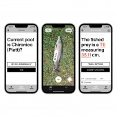
Moving from the current paper-based system to digital provides the following key features: digital fishing licence, instant catches auto-fill, fish measurement tool, detailed report of the fishing activity to be submitted to the authorities.
Furthermore it offers a comprehensive list of species to be consulted, a map with real-time informations about fishermen and locations, and a direct contact with the authorities.
OPERATION / FLOW / INTERACTION:
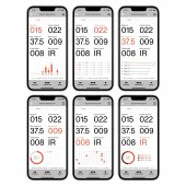
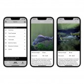
The app is structured in 3 main areas: Species, Compiling and Maps. Species section shows an exhaustive list of the fishes in the region. Compiling allows to record the catches. Maps indicates all the fishing areas with their relative informations. Secondary areas are Profile and Menu. Profile contains data and graphs related t fisherman seasons. Menu is divided into a further 6 useful tertiary sections: Contacts, Regulation, User details, Sessions, Settings and Notices.
PROJECT DURATION AND LOCATION:
The project started in March 2021 and had its first prototype release and test phase in January 2022 in Lugano, Switzerland.
FITS BEST INTO CATEGORY:
Interface, Interaction and User Experience Design
|
PRODUCTION / REALIZATION TECHNOLOGY:
The project was designed by following the standard process of a digital product creation.
It went through 4 phases: the research phase (field studies / survey / user interview), the analysis phase (user persona / user journey / user flows / definition of features and MVP), the design phase (information architecture / wireframes / mood-board / hi-fi mockups / prototyping) and the testing phase (usability test / survey).
Employed softwares: Typeform, Miro, Whimsical, Figma.
SPECIFICATIONS / TECHNICAL PROPERTIES:
Catch Tracking benefits from two native system features such as geolocation and measurement. Geolocation helps with the auto-filling of the user location within Compiling section. It also aids in ensuring a more comprehensive map with real-time users and locations. Measurement tool is used to digitally enter the fish length. This feature is a major benefit not only for the fisherman but also for the fishery fauna: hand contact and therefore unnecessary damage to the fish are avoided.
TAGS:
Swiss Design, App Design, User Experience, Data Visualisation, Fishing, Digital Innovation, Use of Technology
RESEARCH ABSTRACT:
Between June and September 2021, several fishing sessions were carried out to locally assess the use of the paper-based system and grasp its flaws.
Furthermore, to gather more information, a survey was conducted among a panel of 10 people. The results led to define the following details: user persona, logbook usage and its pros and cons, awareness of the regulation, digitalisation needs and acceptance, smartphone usage in daily life and during fishing activity and its pros and cons.
CHALLENGE:
The key challenge was to deliver an innovative product with a smooth switchover from paper to digital. A related goal was to ensure a smooth user experience suitable for the most and least tech-savvy users. To be successful in doing so, it was essential to keep consistency with the current system, to balance the amount of information displayed and to create a recognisable and intuitive design system.
ADDED DATE:
2021-12-22 21:26:17
TEAM MEMBERS (2) :
Simone Ardito and Samy Boutefah
IMAGE CREDITS:
Studio Syamo, 2021.
|


