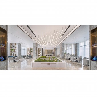
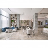
Greentown Liuxiangyuan Sales Center by Zhonghehongmei Interior Decoration Design |
Home > Winners > #133925 |
| CLIENT/STUDIO/BRAND DETAILS | |
 |
NAME: Zhonghehongmei Interior Decoration Design PROFILE: Hongmei Branch Decoration Design Co., Ltd. is established by Greentown Group and TRD Design Group, “Hong” comes from Ancient Chinese Prose, which means a calm and deep pool. Interior design is art centered on space. We hope that our insight and design style can be as deep and delicate as "Hong", calm and powerful. We mainly work space design. Service business include interior design, furnishing design, sculpturing of space, artworks design and layout. The scope of services includes real estate display, Office Space, Boutique Hotel, Art Restaurant, Children Pleasure Space, Specials Town and so on. The company takes Quality, Trust, Efficiency and Sharing as its values, and constantly improves the design value as its vision. Based on the long-term cooperation with Greentown, Hongmei Branch has completed many projects in Greentown System. In 2020, Yantai Greentown Sales Center, Xining Greentown Courtyard, Jiaozuo Greentown Sales Center and other projects have won great achievements in sales and public praise. |
| AWARD DETAILS | |
 |
Greentown Liuxiangyuan Sales Center by Zhonghehongmei Interior Decoration Design is Winner in Interior Space and Exhibition Design Category, 2021 - 2022.· Read the interview with designer Zhonghehongmei Interior Decoration Design for design Greentown Liuxiangyuan here.· Press Members: Login or Register to request an exclusive interview with Zhonghehongmei Interior Decoration Design. · Click here to register inorder to view the profile and other works by Zhonghehongmei Interior Decoration Design. |
| SOCIAL |
| + Add to Likes / Favorites | Send to My Email | Comment | Testimonials | View Press-Release | Press Kit |
Did you like Zhonghehongmei Interior Decoration Design's Interior Design?
You will most likely enjoy other award winning interior design as well.
Click here to view more Award Winning Interior Design.


