DESIGN NAME:
Nongfu Spring Mix
PRIMARY FUNCTION:
Milk Tea
INSPIRATION:
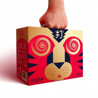
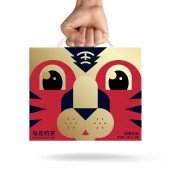
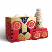
The essence of this brand is "mix". In Chinese, it means "da". For the brand, "da" is the process of mixing real milk and tea together, but the most common meaning of "da" is "beat". It happened that one catchy Chinese nursery rhyme "beat the tiger" includes brand name "da" and Chinese new year zodiac "tiger", so it becomes the inspiration of the design. The whirl is the brand equity taken from the inner pack which communicates the technique behind. In addition, the whirl is often used for expressing dizziness. In order to fit the happy occasion, the packaging is the red tiger face, while its eyes are replaced with whirls. When consumers hold this gift box, it looks like they are beating the tiger. It provides celebration atmosphere, fun and interactivity to consumers.
UNIQUE PROPERTIES / PROJECT DESCRIPTION:
2022 is tear of the tiger in China. During Chinese new year, most of products are turning red and have new year greetings or traditional patterns on packaging. It is the safest and acceptable way to do it but lacks surprise and creativity. As e-commerce exclusive packaging, the business goal is to attract young consumers and create a buzz on social media, so the team breaks the conventional design language and use a dramatic way to establish the link between packaging and the year of tiger. The idea is based on a well-known Chinese nursery rhyme which is easier to be remembered and spread among consumers. The product feature is also well combined with tiger. This limited gift box is unique on market.
OPERATION / FLOW / INTERACTION:
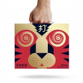
The overall design of the box is based on tiger head to express that it is the packaging created for the year of tiger. The eyes of the tiger are replaced by whirl. When consumers are holding the box, their fists are right above the tiger, which can create the interaction between consumers and packaging. Compared with traditional Chinese new year packaging, this packaging is fun and outstanding.
PROJECT DURATION AND LOCATION:
The project started in Oct, 2021 and the product will be launched in Feb, 2022.
FITS BEST INTO CATEGORY:
Packaging Design
|
PRODUCTION / REALIZATION TECHNOLOGY:
The box is made of paper with gloss lamination
SPECIFICATIONS / TECHNICAL PROPERTIES:
Width 213mm x Depth 141 mm x Height 169mm
TAGS:
packaging, milk tea, China, e-commerce, tiger, Chinese new year
RESEARCH ABSTRACT:
Based on personal experience and desk research on Chinese new year packaging design, the team found out the basic design principles of packaging such as red and gold, blessing copy, traditional pattern, etc. However, unlike dairy or alcohol that are usually purchased for gifting when visiting relatives and friends, milk tea is often purchased for pleasing themselves. Instead of using conventional elements, it is possible to make the packaging fun and unique, which can bring humour and creativity to consumers.
CHALLENGE:
The main challenge is to find the link between products and tiger. The combination between the word "da" and tiger forms a Chinese nursery rhyme "beat the tiger". This nursery rhyme is well-known in China, and it has the potential to create a buzz in market.
ADDED DATE:
2021-12-21 10:11:54
TEAM MEMBERS (4) :
Creative Director: Yang LI, Designer: Jinpei ZHENG, Managing Director: Lei ZHANG and Strategic Planner: Xincheng ZHUANG
IMAGE CREDITS:
All photos credits to blackandgold Shanghai, 2022.
|
