Poro City Exhibition by Chieh-Ting, Yushan Martha and Kyoung Eun |
Home > Winners > #133740 |
 |
|
||||
| DESIGN DETAILS | |||||
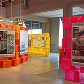
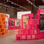
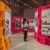
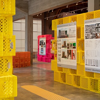
| DESIGN NAME: Poro City PRIMARY FUNCTION: Exhibition INSPIRATION: Packaging is often a means to an end. We receive a good, unwrap it, and discard the container. However, some forms of packaging, like shipping crates and pallets, are designed for durability and reuse. These sturdy qualities often inspire more robust modes of use than initially intended. The same is true for the milk crate. UNIQUE PROPERTIES / PROJECT DESCRIPTION: Poro City proposes a dialogue with the many communities of Los Angeles. Milk crates function as a brick system that is neither transparent nor solid, housing the exhibition without imposing a rigid boundary. The milk crate's flexibility allows for various design options that can adapt to different spaces. Moreover, its immediately familiar iconography makes it approachable to a wide range of audiences. OPERATION / FLOW / INTERACTION: Our vision for this exhibition was to exemplify the ability of people to create the extraordinary from the mundane. Showcasing milk crates, which by their nature are utilitarian objects, celebrates this resourcefulness. The bright and unexpected colors further elevate and transform the material and show it in a new way. PROJECT DURATION AND LOCATION: It is located at Culver City, California. It starts construction on October and stand in the gallery from November to December. FITS BEST INTO CATEGORY: Interior Space and Exhibition Design |
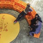
PRODUCTION / REALIZATION TECHNOLOGY: Our modular crate system was designed to be easy and fast to assemble. With the help of volunteers, we were able to construct all of the walls in less than a day. COVID has kept many of us indoors, so it was great to get together at Helms Bakery for the exhibition. SPECIFICATIONS / TECHNICAL PROPERTIES: It is constructed with 1100 counts of 33 cm x 33 cm x 28 cm milk crates and distributed in a 200 square meters gallery. TAGS: exhibition design, reuse, second life, RESEARCH ABSTRACT: We were inspired by the project brief, which called for a design that could be distributed at indoor and outdoor sites throughout Los Angeles. We wanted our design to be recognizable regardless of its location, and to create a space while connecting to each unique neighborhood. We settled on a kit-of-parts construction using milk crates as our primary building material due to their adaptability and recognizability. Assembled as undulating porous walls, crates frame views and emphasize the experiential relationship between exhibition and site. The stacked brick pattern recalls the textures of breeze block walls, iconic surfaces of the LA landscape. The final result is a welcoming and vibrant exhibition in an array of vivid colors. CHALLENGE: Due to the viral milk-crate challenge from Tik Tok, and to discourage climbing on the walls, we also made the decision to treat seating as a separate element rather than integrating it with the exhibition walls. ADDED DATE: 2021-12-16 18:46:15 TEAM MEMBERS (3) : Chieh-Ting Chuang, Martha Kriley and Yushan Men. IMAGE CREDITS: Photo credit: Dylan Corr, Kyoung Eun Park Video Credit: Martha Kriley. Gary Doran Graphic Credit: Nick Imbriale, Christopher Manzano, Philana Kim |
||||
| Visit the following page to learn more: https://shorturl.at/juHZ8 | |||||
| AWARD DETAILS | |
 |
Poro City Exhibition by Chieh-ting, Yushan Martha and Kyoung Eun is Winner in Interior Space and Exhibition Design Category, 2021 - 2022.· Read the interview with designer Chieh-Ting, Yushan Martha and Kyoung Eun for design Poro City here.· Press Members: Login or Register to request an exclusive interview with Chieh-Ting, Yushan Martha and Kyoung Eun. · Click here to register inorder to view the profile and other works by Chieh-Ting, Yushan Martha and Kyoung Eun. |
| SOCIAL |
| + Add to Likes / Favorites | Send to My Email | Comment | Testimonials | View Press-Release | Press Kit |
Did you like Chieh-ting, Yushan Martha and Kyoung Eun's Interior Design?
You will most likely enjoy other award winning interior design as well.
Click here to view more Award Winning Interior Design.


