Tears in Venice Residential by Raymond Li and Tavia Fan |
Home > Winners > #133700 |
 |
|
||||
| DESIGN DETAILS | |||||
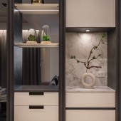
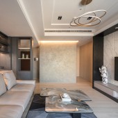
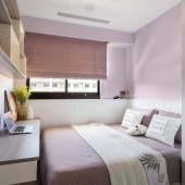
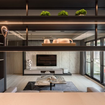
| DESIGN NAME: Tears in Venice PRIMARY FUNCTION: Residential INSPIRATION: The goal is to breakthrough from the original layout by creating more open space, aspiring to develop a better environment for familial interaction. UNIQUE PROPERTIES / PROJECT DESCRIPTION: The design considers introducing light into the interior, maintaining the ambiance regardless of perspective, while also keeping the fluidity of open space. Therefore, creating multi-layers of space and depth in the room. While allowing the residents to gravitate to the room, feeling a sense of welcome and warmth in the space. OPERATION / FLOW / INTERACTION: In order to satisifies the function of the liviing space for 4 memebers by using the connection of the space bewteen living and dinning room to join the conversation. The combination of the indoor living room and The semi-open design of the cabinet is used at the entrance. Bring warm light into the interior to create a warm feeling. The semi-outdoor balcony a new sense of life value. PROJECT DURATION AND LOCATION: The project started in May 2021 in Taipei and finished in September 2021 FITS BEST INTO CATEGORY: Interior Space and Exhibition Design |
PRODUCTION / REALIZATION TECHNOLOGY: The theme of design is “FUSION”. The owner attaches great importance to the parent-child relationship in everyday life, and hopes to have a comfortable and open dynamic living space. Emphasize how open-space can strongly enhance feelings among family members, while allowing the residents to gravitate to the room, feeling a sense of welcome and warmth in the space. SPECIFICATIONS / TECHNICAL PROPERTIES: Width 10000 mm x Depth 9000 mm x Height 3000 mm TAGS: Life, Living, Dream house, Pure, Emotion, Creative, Taichung, Taiwan RESEARCH ABSTRACT: Light is the most elegant makeup artist in the space. Space is the essence of architecture, and "light" is the soul of space. Numerous designers introduce the concept of "light strips" to light up the space in interior design; but the difference is that sunlight can bring people a warm and comfortable feeling. While enriching the spatial context, it also creates a visual sense of light and dark layers and contrast between virtual and real. In the minimalist space form, the light strip can also give it a breathtaking beauty of layers. CHALLENGE: In the process of opening up and merging the two housing units, the biggest problem is that the interior design must meet the requirement restrictions of both the legal review department and structural reinforcement application; while also fulfilling the expectations of the owner. Also, at the onset of planning, there was a girder running through the main living space. Clever design utilizes the depth of the girder as the height of the ceiling, and also uses the location of the girder to separate the living room from the open kitchen. Thus, merging the two spaces together to create a comfortable and open dynamic living space. ADDED DATE: 2021-12-15 09:34:09 TEAM MEMBERS (4) : Raymond Li, Tavia Fan, Kevin Wang and IMAGE CREDITS: Image #1 Raymmond Li by Laman Studio Image #2 Raymmond Li by Laman Studio Image #3 Raymmond Li by Laman Studio Image #4 Raymmond Li by Laman Studio Image #5 Raymmond Li by Laman Studio PATENTS/COPYRIGHTS: trademark: Laman Studio (2015) Raymond Li |
||||
| Visit the following page to learn more: http://shorturl.at/hpwIJ | |||||
| AWARD DETAILS | |
 |
Tears in Venice Residential by Raymond Li and Tavia Fan is Winner in Interior Space and Exhibition Design Category, 2021 - 2022.· Press Members: Login or Register to request an exclusive interview with Raymond Li and Tavia Fan. · Click here to register inorder to view the profile and other works by Raymond Li and Tavia Fan. |
| SOCIAL |
| + Add to Likes / Favorites | Send to My Email | Comment | Testimonials | View Press-Release | Press Kit |

