Kagoshima Shinsen Cha Green Tea Beverage by Shoichiro Takei and Eriko Kunikata |
Home > Winners > #133397 |
 |
|
||||
| DESIGN DETAILS | |||||
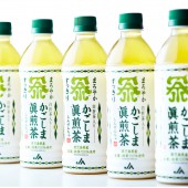
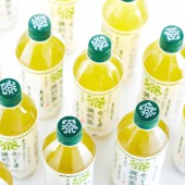
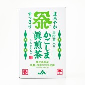
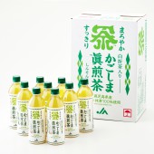
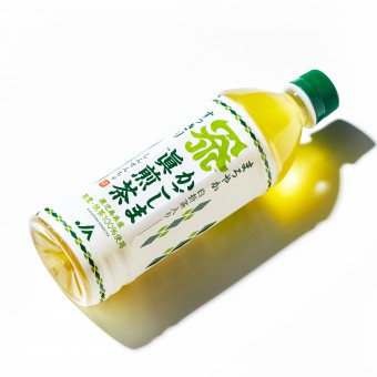
| DESIGN NAME: Kagoshima Shinsen Cha PRIMARY FUNCTION: Green Tea Beverage INSPIRATION: The team chose a tea flavor with a comfortable and refreshing tone in trend as well as a delicious aftertaste. Most Japanese bottled teas use a dark green or a green gradation background. Meanwhile, this product is a comfortable and refreshing beverage and so they decide to use white as a base color and place a simple and casual object with two tea leaves. The logo and naming of the tea are placed in the center of the layout to give an impressive appearance at the store. UNIQUE PROPERTIES / PROJECT DESCRIPTION: The team name the product to express pride and history of leading the Japanese tea industry for many years, allowing for the meaning and sound of the name. For creating this bland logo, they blend some elements, that is the client's initial, an active volcano Sakurajima Mt. (the symbol of Kagoshima in Japan) and T-E-A into only one Kanji as a mark design and the hidden message. So that the beautiful green color of this tea beverage brings out, the team use white as a basis for labeling and place simple objects with two kinds of tea leaves. Moreover, to express Japanese atmosphere, Hiragana is incorporated into the product name, and traditional Japanese colors are used on the label. OPERATION / FLOW / INTERACTION: The team were involved from a much earlier stage of the product development and when deciding tea flavor as well. And the same concept was also applied to various promotional materials such as shipping boxes, banners, posters, and flyers. PROJECT DURATION AND LOCATION: The project started in August 2020 in Kagoshima, Japan, and finished in April 2021 in Kagoshima. The team tried to express the uniqueness of Japan and Kagoshima to make a strong impact on its design. As a result, in a short period of time after its launch, it became a record seller, which expanded sales channels one after another. The design of this shipping box was so well received that the client decided to sell recyclable box of tea with the same design. FITS BEST INTO CATEGORY: Packaging Design |
PRODUCTION / REALIZATION TECHNOLOGY: It doesn’t matter how wonderful a product is or how much potential an initiative has; if a company cannot effectively promote its products or ideas, it won’t be able to thoroughly communicate its value to the world. The clients of the team consult them with various concerns, such as sales of their clients' existing products or developing a new business. The team approach is extremely simple and effective. They focus on the spirit of a company and its initiatives, and the essence of its products. They also consider the motives of the company’s management and its vision for the future, and incorporate all of these factors into designing a one-and-only brand. They spend the most time and effort on going beyond the surface decorative elements to perceive the true essence of a company and its products. Then they highlight and emphasize the best features, and reflect them in a distinctive design that is unique in the world. They provide total and ongoing support in building their client’s brand, so their clients are able to differentiate their company and product in the market, and boost their sales. Their wish is for clients to use them as a catalyst to bring about a brilliant chemical reaction in their clients' business. SPECIFICATIONS / TECHNICAL PROPERTIES: W66×H206×D66 Kagoshima prefecture’s tea production is the second largest agricultural output in Japan. However, most of the tea leaves are supplied to companies outside Kagoshima to process. Therefore, Kagoshima is little known as one of the leading tea producing regions in Japan. That is why the team had to build a strong branding strategy in order to create a new product of high-quality bottled tea focusing on its ingredients and production method. TAGS: #KATALSEVEN, #packagedesign, #brandingdesign, #logodesign, RESEARCH ABSTRACT: In addition to the history of tea in Japan and development process of green tea industry including its tradition and production area, the team examined the demand for green tea in Japan and overseas, and its product development. Meanw CHALLENGE: The most difficult part of its design was how to express its impressive appearance in a limited space of the product. Also, from a branding point of view, the team thought it would be best to use the logo not only for this product but also as a banner for the client's tea brand. Therefore, this logo should be versatile, highly visible and have a strong impact, so that it could be used for future series of the product as well. As for its naming, they considered a number of factors, such as the visual element, the nuance of the word, and its registration issue. ADDED DATE: 2021-11-30 15:37:52 TEAM MEMBERS (2) : Shoichiro Takei (Designer) and Eriko Kunikata (Producer) IMAGE CREDITS: Hiroki Ogusu (Photo) PATENTS/COPYRIGHTS: Copyrights belong to KATAL SEVEN Co., Ltd. The client registered the logo and naming of this product as a trademark in 2021(No.T6408418/T2020-133872). |
||||
| Visit the following page to learn more: http://www.katalseven.com | |||||
| AWARD DETAILS | |
 |
Kagoshima Shinsen Cha Green Tea Beverage by Shoichiro Takei and Eriko Kunikata is Winner in Packaging Design Category, 2021 - 2022.· Read the interview with designer Shoichiro Takei and Eriko Kunikata for design Kagoshima Shinsen Cha here.· Press Members: Login or Register to request an exclusive interview with Shoichiro Takei and Eriko Kunikata. · Click here to register inorder to view the profile and other works by Shoichiro Takei and Eriko Kunikata. |
| SOCIAL |
| + Add to Likes / Favorites | Send to My Email | Comment | Testimonials | View Press-Release | Press Kit |
Did you like Shoichiro Takei and Eriko Kunikata's Packaging Design?
You will most likely enjoy other award winning packaging design as well.
Click here to view more Award Winning Packaging Design.


