Eonian Tile Gallery Mosa Office Showroom by An Zhi Zheng and Cheng Ze Li |
Home > Winners > #131729 |
 |
|
||||
| DESIGN DETAILS | |||||
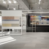
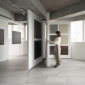
| DESIGN NAME: Eonian Tile Gallery Mosa PRIMARY FUNCTION: Office Showroom INSPIRATION: With the concept of a tile museum, different display layouts are used to highlight the tiles color, texture, and other features, guiding customers to learn about the products in terms of aesthetics and applications while offering a unique and intriguing purchasing experience. UNIQUE PROPERTIES / PROJECT DESCRIPTION: 80 sqm warehouse to be renovated into a space with an office, showroom, teaching studio, and presentation area. Inspired by the concept of an art gallery with the century-old brand MOSA as a centerpiece, our design features tiles as artworks, making customers selecting experience an aesthetic journey. The staggered, detached design and glass volumes give this multifunctional space a weightless look. The flexible displays lead to efficient space use and lend the vertical surfaces various looks. OPERATION / FLOW / INTERACTION: Glass walls, gaps, display boards, and sliding doors are integrated to define the office boundary while offering versatility, which can be adapted accordingly and transform the impression. The meeting table with built-in tile storage racks renders a stylish look and handy access. PROJECT DURATION AND LOCATION: The project started in April 2020 and finished in JUNE 2020 in Taipei FITS BEST INTO CATEGORY: Interior Space and Exhibition Design |
PRODUCTION / REALIZATION TECHNOLOGY: A large white background sets off the tiles signature texture, while a black wall specially designed for the colored tile series provides a contrast to the tiles brightness and colorfulness. The exposed ceiling and neutral color palette also embody the characteristics of MOSA. SPECIFICATIONS / TECHNICAL PROPERTIES: 80 square metre TAGS: showroom, office, tile, mosa, gallery RESEARCH ABSTRACT: Tiles are treated as artworks, adding new value to the showroom. Areas are divided based on their characteristics; the outer area only has the axis of display boards under the beam to ensure a load-bearing structure while the flexible display layouts keep the circular space airy. CHALLENGE: The page-like boards make the selecting process like reading a book; the foldable structure reduces oppressive feelings and increases the display items. A volume combining storage cabinets and a focal-point display wall occupies a corner, toning down the obtrusive right angle. ADDED DATE: 2021-10-01 07:21:43 TEAM MEMBERS (3) : Zheng An Zhi , Li Cheng Ze and IMAGE CREDITS: BH Interior Design Ltd. PATENTS/COPYRIGHTS: BH Interior Design Ltd. |
||||
| Visit the following page to learn more: https://www.facebook.com/behinddesignfan |
|||||
| AWARD DETAILS | |
 |
Eonian Tile Gallery Mosa Office Showroom by An Zhi Zheng and Cheng Ze Li is Winner in Interior Space and Exhibition Design Category, 2021 - 2022.· Read the interview with designer An Zhi Zheng and Cheng Ze Li for design Eonian Tile Gallery Mosa here.· Press Members: Login or Register to request an exclusive interview with An Zhi Zheng and Cheng Ze Li. · Click here to register inorder to view the profile and other works by An Zhi Zheng and Cheng Ze Li. |
| SOCIAL |
| + Add to Likes / Favorites | Send to My Email | Comment | Testimonials | View Press-Release | Press Kit |
Did you like An Zhi Zheng and Cheng Ze Li's Interior Design?
You will most likely enjoy other award winning interior design as well.
Click here to view more Award Winning Interior Design.


