Fujifilm Clay Studio2 Office by Koji Aoki, Lin Su and Atsushi Fujita |
Home > Winners > #131321 |
 |
|
||||
| DESIGN DETAILS | |||||
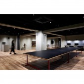
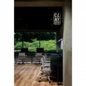
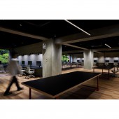
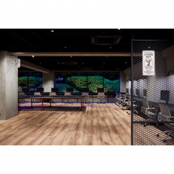
| DESIGN NAME: Fujifilm Clay Studio2 PRIMARY FUNCTION: Office INSPIRATION: The office was designed with the hope that people would work while cultivating the sensitivity to see the fragility and preciousness of the natural world as beautiful and to immerse themselves in the designs they create. The office was designed with this in mind. Space itself is used as a "guide" for immersion. Used the original landscape of the building to promote immersion in a calm state of mind, as if visiting a temple or shrine. UNIQUE PROPERTIES / PROJECT DESCRIPTION: It goes against the "dynamic" offices that exist today, where communication is the main focus. However, on the contrary, a place where people can gather and immerse themselves in friendly competition is the antithesis of the current office. Natural scenery used as the background for the landscaping of a garden adds seasonal changes to the space and enriches the experience of working while immersed. OPERATION / FLOW / INTERACTION: While creating an environment where employees can look outward to design, the ability to turn around and have a quick meeting at a BIG table adds flexibility and adaptability to the "immersion. This layout is not face-to-face, and also allows for social distance, so even without the acrylic panels, droplet infection can be controlled. PROJECT DURATION AND LOCATION: Start of design in November 2020, completion in April 2021 Nishi-Azabu, Minato-ku, Tokyo FITS BEST INTO CATEGORY: Interior Space and Exhibition Design |
PRODUCTION / REALIZATION TECHNOLOGY: concrete, painting, wood cement board SPECIFICATIONS / TECHNICAL PROPERTIES: The space is made of only unprocessed materials and has the appearance of being made up of only beams and pillars. While creating an environment where everyone can face outward to design, the ability to turn around and have a quick meeting at a big table adds flexibility and adaptability to the "immersion. This layout is not face-to-face, and also allows for social distance, so even without acrylic panels, droplet infection can be controlled. TAGS: a place for immersion, dynamic, feel of material unprocessed material, natural scenery used as the background for the landscaping of a garden, 7m big table, To have nothing is to have plenty, Work while cultivating the sensitivity to see the fragility and preciousness of the natural world as beautiful, Length 7m large table RESEARCH ABSTRACT: This is the office for Fujifilm's product and visual design. As a place to practice design management, have created a new base, "Clay Studio 2" in addition to the current office. If the current office is a "dynamic" space, the new office is planned with immersion as a "static" space in mind. Leased area: 300㎡, use: office, building location: Tokyo, Move-in department: Fujifilm Design Center, Number of residents: 26 CHALLENGE: It was difficult to unite concentration and communication. It was planned with the hope that people would immerse themselves in the designs they create. This is contrary to the many "dynamic" offices that exist today. This is contrary to the many "dynamic" offices that exist today, where the main focus is on communication. On the contrary, however, believe that it is the antithesis of the current office, where people can gather together and immerse themselves in friendly competition. ADDED DATE: 2021-09-29 13:07:57 TEAM MEMBERS (3) : Director:Koji Aoki, Design:Lin Su and Design:Atsushi Fujita IMAGE CREDITS: Koji Aoki, Lin Su and Atsushi Fujita, 2021. |
||||
| Visit the following page to learn more: https://design.fujifilm.com/ja/news/2021 |
|||||
| AWARD DETAILS | |
 |
Fujifilm Clay Studio2 Office by Koji Aoki, Lin Su and Atsushi Fujita is Winner in Interior Space and Exhibition Design Category, 2021 - 2022.· Press Members: Login or Register to request an exclusive interview with Koji Aoki, Lin Su and Atsushi Fujita. · Click here to register inorder to view the profile and other works by Koji Aoki, Lin Su and Atsushi Fujita. |
| SOCIAL |
| + Add to Likes / Favorites | Send to My Email | Comment | Testimonials | View Press-Release | Press Kit |


