2020 Super Star Sports Performance Event by Andre Tehhsi Chen |
Home > Winners > #131229 |
 |
|
||||
| DESIGN DETAILS | |||||
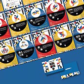
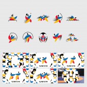
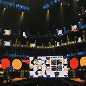
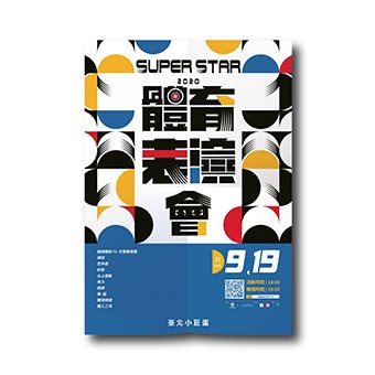
| DESIGN NAME: 2020 Super Star PRIMARY FUNCTION: Sports Performance Event INSPIRATION: The typography in this advertising communication design visualizes the momentum of every sport by transforming the calligraphy form and includes vital sports elements in the event into its structure, such as archery, tennis court. Colors were a significant focus on this occasion, with the goal being to break free of the five colors of the Olympic rings and stick to the sports category promoted this year. For inspiration, we went to the vibrant colors of an archery target. We chose indigo, blood red, and glory gold yellow as symbols of the goal in every athlete’s mind and assisted with black and white colors. UNIQUE PROPERTIES / PROJECT DESCRIPTION: The “2020 Super Star: Sports Performance Event” is an annual sports show held by the Taiwan Government. The event aims to promote and connect different sports to the public and glorify the fantastic achievement that professional athletes achieved in Taipei Arena, Taiwan. The design was developed in various formats in the event, such as advertising posters, campaign brochures, kinetic pictograms, TVCF, background videos, motion graphics, and digital signage. OPERATION / FLOW / INTERACTION: It's the first time to promote a national sports event with key patterns and kinetic pictograms since mascot is the most popular communication design in the related events. To create pattern and kinetic pictograms with novelty, here are the creative directions: 1. To promote sports and physical education as the primary purpose, the design of key patterns integrated into the momentum, strength, and beauty that sports show of each race. 2. To communicate with the joy, intuition, and fun of sports, the design of motion graphics illustrates the characteristic of athletes in the different sports categories. PROJECT DURATION AND LOCATION: The project started in January 2020 and finished in December 2020, and the advertising and campaign series were released and exhibited in September 2020. “2020 Super Star: Sports Performance Event” was held on September 19 in Taipei Arena, Taiwan. More than 30,000 audiences from the country will participate in the event. |
PRODUCTION / REALIZATION TECHNOLOGY: The key visual design, patterns, and kinetic pictograms are made graphically. The team created the animation in After Effect for advertising motion graphics and generated the animated images with an APNG creation tool such as APNG Assembler. For the print graphic, the team layout the artworks in Illustrator. SPECIFICATIONS / TECHNICAL PROPERTIES: Advertising poster: Print/700 mm x 1000 mm Campaign brochures: Print/256 mm x 184 mm/18 pages Kinetic pictograms: AVI/APNG/10 set TVCF: AVI/4K HDTV/30 Sec. Background videos: AVI/4K HDTV/in the loop. Motion graphic: AVI/APNG Digital signage: Jpeg/Mp4/9:16/1080 x1920 Px Banner : Jpeg/APNG/1250 x203 Px/1200 x620 Px/1200 x400 Px TAGS: Typography, Kinetic Pictograms, Pattern, Motion Graphic, Taiwan, Sports Performance Event, Super Star, Archery, Tennis, Wrestling RESEARCH ABSTRACT: The design of “2020 Super Star: Sports Performance Event” is based on promoting the importance of physical education, connecting different sports to the public, and glorifying the fantastic achievement of professional athletes of Taiwan. Take the Archery target to represent the concept of goals and apply the color plan of this project. There could be different goals for athletes in specific points; start points, turning points, and viewpoints, the design shaped the idea with the points (circles.) Transformed the round shapes into different sports pictograms and key visual patterns. CHALLENGE: The color plan and how the graphic communicates are significant challenges to create a fun, vibrant, and welcoming atmosphere for the key visual design. Three primary colors (C/M/Y) and K are the origin of every color, which symbolize the idea that every beginner devotes themselves to sports to always stay true to themselves. Based on the concept, the goal is to break free of the five colors of the Olympic rings and stick to the sports category promoted this year. We went to the color combination of the Archery target. We chose indigo, blood red, and glory gold yellow as symbols of the goal in every athlete’s mind and adjusted the hue/saturation to best fit the media we will access through the project. Besides its cheerful color result, this advertising design brings a distinctively robust and bold visual impact with the sports elements integrated typography characteristics and repetitive pattern. In order to find out what sports elements and symbols could be the leading concept for the public to catch the main idea of this event, the whole research and study is the result and great effort of both design team and related Sports Associations in Taiwan. ADDED DATE: 2021-09-29 05:40:17 TEAM MEMBERS (5) : Art Director: Andre Teh-hsi Chen, Designer: Han-Long Lee, Designer: Mu-Yun Ke, Designer: Shi-Xuan Kuo and Designer: Chun-Wei Chiu IMAGE CREDITS: Image #1: Andre Teh-hsi Chen Image #2: Andre Teh-hsi Chen Image #3: Andre Teh-hsi Chen Image #4: Andre Teh-hsi Chen Image #5: Andre Teh-hsi Chen Video Credits: Sports Administration, M.O.E, R.O.C (TAIWAN) PDF: Andre Teh-hsi Chen PATENTS/COPYRIGHTS: copyrights: Copyrights belong to Sports Administration, M.O.E, R.O.C (TAIWAN), 2020. |
||||
| Visit the following page to learn more: https://www.youtube.com/watch?v=eLNqWSEV |
|||||
| AWARD DETAILS | |
 |
2020 Super Star Sports Performance Event by Andre Tehhsi Chen is Winner in Advertising, Marketing and Communication Design Category, 2021 - 2022.· Read the interview with designer Andre Tehhsi Chen for design 2020 Super Star here.· Press Members: Login or Register to request an exclusive interview with Andre Tehhsi Chen. · Click here to register inorder to view the profile and other works by Andre Tehhsi Chen. |
| SOCIAL |
| + Add to Likes / Favorites | Send to My Email | Comment | Testimonials | View Press-Release | Press Kit |
Did you like Andre Tehhsi Chen's Advertising Design?
You will most likely enjoy other award winning advertising design as well.
Click here to view more Award Winning Advertising Design.


