DESIGN NAME:
Yabi Kitchen
PRIMARY FUNCTION:
Restaurant
INSPIRATION:
This project is a dining space in a new building, and it is the first store for the client to expand their branch brand. Therefore, in addition to achieving the basic functional requirements, the designer also makes use of color, lighting, and an open kitchen to create a space that reflects the core image of the brand. At the same time, this work will be reproduced and developed in a chain.
UNIQUE PROPERTIES / PROJECT DESCRIPTION:
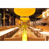
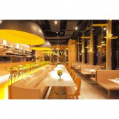
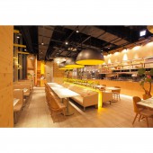
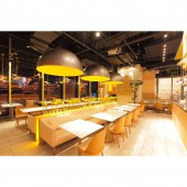
This project is a dining space in a new building, and this restaurant mainly sells Asian fusion cuisine. Open kitchen, two-person seating area, four-person seating area, sofa seating area, and staff space are well planned in the project. The designer takes the smooth traffic flow as the main conception, and through the proper arrangement of each section to create a perfect dining space. The interior space is an open-ended design. The designer keeps the ceiling height of the original building and lowers the window countertop to provide a nice view.
OPERATION / FLOW / INTERACTION:
The designer takes the traffic flow into account, places the open kitchen far away from the entrance while separating the pick-up area and the recycling area to ensure smooth flow and hygiene. After the coordination with the management of the building, the windows are lowered to meet the needs of sound insulation and fire protection, and also to wider the view. To eliminate the situation that most of the seats have dead corners due to the clustering of pipes in the original base, the designer uses the staff room, storage, cashier, and service area to achieve a smooth traffic flow.
PROJECT DURATION AND LOCATION:
The project finished in December 2018 in Taiwan.
FITS BEST INTO CATEGORY:
Interior Space and Exhibition Design
|
PRODUCTION / REALIZATION TECHNOLOGY:
Artificial stone, iron mesh, white teak, modeling chandelier, and architectural lighting. After a detailed discussion with the client, the designer selects ginger as the brand image color to decorate the lighting and cabinets. Besides, the color is matching with wood material, leather seats, and sofa to build a harmonious atmosphere.
SPECIFICATIONS / TECHNICAL PROPERTIES:
The original height of the ceiling is preserved, and a yellow-painted wire mesh is used to cover the pipes and steel beams of the building. Meanwhile, the designer uses modeling chandeliers and suspended cabinets to achieve a sense of lightness. The designer also uses yellow lighting to highlight the brand core image. In addition, the designer negotiates with the building management to lower the windows while achieving the sound insulation and fire protection requirements.
TAGS:
Commercial space, dining space, modeling lighting, modern style, open kitchen.
RESEARCH ABSTRACT:
The designer strikes a balance between the strict regulations of the original building and the client requirements. Through the perfect planning of the traffic flow, the designer meets the demands of each section. Accurately evaluates the size of the open kitchen and sets its location far from the entrance to separate customers from the staff traffic flow. Separates the pick-up area and the recycling area to ensure smooth traffic flow and hygiene. Last, the deformed areas are changed a staff lounge, storage, cashier, and service area to create a complete dining space.
CHALLENGE:
How to create an open kitchen, seating area with 91-seat, and a staff area that meets the client expectations while faced with the harsh construction management and dead corner of the original building are the main points of the designer's plan. By clearly sorting out the uses in each section, the designer arranges the seating area in a square pattern. In addition, the deformed areas are planned as staff lounge, service counter, storage room, etc., to achieve a harmonious configuration.
ADDED DATE:
2021-09-27 09:28:57
TEAM MEMBERS (2) :
Hui-Chu Huang, Chien-Tsung Yeh and
IMAGE CREDITS:
JiJi Interior Design
|


