DESIGN NAME:
Azure Blue and Emerald Harmony
PRIMARY FUNCTION:
Residential
INSPIRATION:
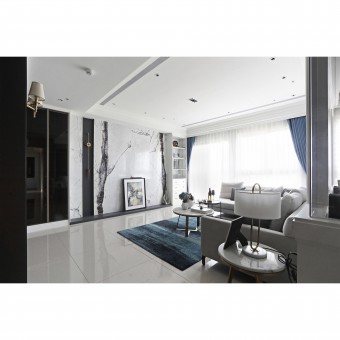
The client enjoys reading and living and decided to create a living space surrounded by daylight, hoping to integrate the interior design with the 10,000 level-ground parks outside the window. Hence, the designer wished to connect the space with the outdoor scenery and construct a harmonious aesthetic. The color arrangements were critical while planning this project; the calm and restrained black, gray and white tones are combined with the selection of materials to quench an elegant and quiet harmony.
UNIQUE PROPERTIES / PROJECT DESCRIPTION:
The client enjoys reading and living and decided to create a living space surrounded by daylight, hoping to integrate the interior design with the 10,000 level-ground parks outside the window. Hence, the designer wished to connect the space with the outdoor scenery and construct a harmonious aesthetic.
OPERATION / FLOW / INTERACTION:
The design team took natural advantage of this space and used thick black window frames with harmonious proportions, just like a picture frame to capture the flowing clouds and layers of mountains outside the windows, as if enjoying an endless landscape painting that lightens up the day after coming home. To highlight the consistency of the overall space, the semi-open-end display shelves are used in the functional area; they are equipped with modest drawers and gray glass doors, allowing the client who is fond of collecting treasures and wines to enjoy a comprehensive display and storage space.
PROJECT DURATION AND LOCATION:
The project finished in January 2021 in Taiwan.
FITS BEST INTO CATEGORY:
Interior Space and Exhibition Design
|
PRODUCTION / REALIZATION TECHNOLOGY:
Ink-black colors paired with shades of white, Fucheng marble television wall with abstract branch shapes, first-class flame-proof closets, gray glass, tiles, wall scones, chandeliers, French windows, and laminates.
SPECIFICATIONS / TECHNICAL PROPERTIES:
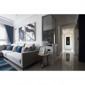
This project is a newly constructed 33-ping residence located on the 14th floor and is equipped with 4 bedrooms, 2 living rooms, and 2 bathrooms with natural lighting. To draw daylight into the interior with balance, the spatial is adopted with a semi-open-end design, gray glass sliding doors with iron frames, and a leading white tone supplemented by calm elements. By combining different lighting fixtures, such as linear recessed lights, wall lights, display lights, and chandeliers, a unique space atmosphere is brought to each area of the residence during the night.
TAGS:
Drawing view into the room, Lighting and transparency, Open-end space, Elegant with light luxury, Curved vocabulary.
RESEARCH ABSTRACT:
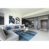
The designer adopted the open-end approach to maximize the use of space; by converting one of the rooms into a semi-open space, the abrupt opening angle of the original door is eliminated. At the same time, the sliding iron-framed gray glass door design has saved a lot of space within the narrow housing layout. The designer focused on the overall balance of the space; therefore, the color scheme was carefully thought out. Colors of black, gray, and white are used as the main tonal of the room and are complemented by blue and gray tones of soft furnishings.
CHALLENGE:
One of the critical points that the designer considered was integrating the view of the windows into the interior to create a harmonious and coherent feeling. First of all, matching colors of black, white, and gray are used as the central tonal as much as possible; through the same tonal selection and the rich texture of materials, layers with rich changes are interpreted within the low-chroma spatial tone. Secondly, the window entrance, floorings, and handles were arranged coherently to deliver perfection and harmony in function and sight.
ADDED DATE:
2021-09-27 07:52:50
TEAM MEMBERS (1) :
TANG-CHIEH CHEN
IMAGE CREDITS:
W-house interior design
|


