DESIGN NAME:
Gracious Flow
PRIMARY FUNCTION:
Medical Clinic
INSPIRATION:
Public area extension is applied to transcend the normal atmosphere of a proper family place. The living room is pure simplicity, neat and bright with embellishing decorations. The dining area has a massively curved ceiling that matches the lovely yellow lights, the yellow lights will project a reflection on the grey marble table and create an illusionary space. For the design of this clinic, the design recalled his own experience while waiting for a colonoscopy and the anxiety induced by the cold, unwelcoming atmosphere of the traditional medical clinic.
UNIQUE PROPERTIES / PROJECT DESCRIPTION:
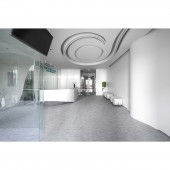
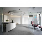
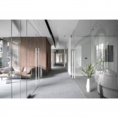
The clinic is constructed with several curved elements to create smooth and flowing lines. The consulting and treatment rooms are separated by glass to increase transparency. French windows and glass partitions allow the clinic to be bathed in natural light. The white ceilings and walls are contrasted against grey flooring to create a sense of serenity. The ceiling line is curved and rounded to eliminate harsh lines as well as to allow for the flow and gathering of "qi" in Chinese Feng Shui. One of the consulting rooms features a panel shaped like the tip of a tongue as whimsical nod to this gastroenterologist office.
OPERATION / FLOW / INTERACTION:
This space is a medical clinic. The designer looked from the patient perspectives for the interior design. First, an open-end method is applied with glass-made partitions to create transparency and a sense of expansive. At the same time, sofa and chair waiting areas are set up to give patients peace of mind. Secondly, curved elements are outlined on the ceiling and the partitions that eliminate the dull spatial feeling of traditional clinics; the arc-shaped designs also guide directions for users within the directionality structure while maximizing the space effect.
PROJECT DURATION AND LOCATION:
The project is finished in April 2020 in New Taipei City, Taiwan.
FITS BEST INTO CATEGORY:
Interior Space and Exhibition Design
|
PRODUCTION / REALIZATION TECHNOLOGY:
Glass, artificial stone, walnut. The material selection of this project mainly adopts blank walls that guide the traffic flow and flexible artificial stone that echo the design of the reception desk. Brown walnut trimmings are used to bring warmth to the pure-white interior and create a comforting environment for patients.
SPECIFICATIONS / TECHNICAL PROPERTIES:
The actual interior design space is around 70 ping consisting of a lobby, a reception area, two examination rooms, one major and one minor gastroenterology surgery room, one ultrasound examination room, one X-ray room, one consulting room, one recovery room, one lounge, one laboratory room, and an office.
TAGS:
Clinical space, curved methods, transparent planning, outdoor scenery placements, imagery methods, modern elements.
RESEARCH ABSTRACT:
This space is located on the third floor of a newly-constructed commercial building. The designer emphasized the feelings and emotions of the patients and designed a clinic that eliminates the pressure and stiffness. An open-end method is applied with modern tonal and approaches; shades of white and grey are used as the primary colors. The overall is decorated with flowing curved lines that decrease pressure, a gallery-like clinic that creates transparency and inner peace.
CHALLENGE:
The most challenging part of this project was the control circuit arrangements and the arrangement of the various rooms of differing function within the limited space. The lobby was the most complex to design as the confluence of five units. Five units have to merged in the space while maintaining transparency, functionality, and visual balance.
ADDED DATE:
2021-09-24 10:54:13
TEAM MEMBERS (1) :
Zi-Chen Lin
IMAGE CREDITS:
Calm Arts Design
|


