Over the Rainbow Interior Design by Weng Jo-Jung |
Home > Winners > #130568 |
 |
|
||||
| DESIGN DETAILS | |||||
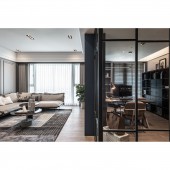
| DESIGN NAME: Over the Rainbow PRIMARY FUNCTION: Interior Design INSPIRATION: The male owner prefers refined and a little masculine industrial style, while the female owner likes elegant, light, and luxurious American neoclassicism. Therefore, in a public space, how to reconcile the conflict between the two styles through the flexible use of different color rendering, material differences, classic lines, and interior decoration vocabulary. Create a wealth level of sensory and beauty user experience, reflect the combination of hardness and softness of classical and modern UNIQUE PROPERTIES / PROJECT DESCRIPTION: This case is single-story residential planning. According to the owner's need, adjustment of wall lines are carefully allocated the proportion of each unit. Create a large-scale entryway, a transparent and unrestrained public domain, a complete dining and kitchen area, and relatively intact functions. With exclusive sections of the circulation, both the master bedroom and another bedroom lay a beautiful profile and good physique for a modern house with a sense of design and humanity. OPERATION / FLOW / INTERACTION: The designer skillfully delimited the entryway by high cabinets, combined with the exquisite combination of pattern tiles and the reflection of the tea mirror wall to meet some living functions. The depth of the living room passes through the back wall of the sofa. After the turning, connected with the irregular division of the high cabinet column, defined the field axis with the dark blue main wall volume. PROJECT DURATION AND LOCATION: The project finished in May. 2020 in New Taipei City, Taiwan. FITS BEST INTO CATEGORY: Interior Space and Exhibition Design |
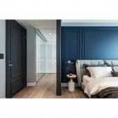
PRODUCTION / REALIZATION TECHNOLOGY: The pattern tiles and waterproof wood floors at the entrance and the living room. The difference between the two materials symbolizes the field conversion. The warm gray tones used in the high cabinet columns at the entryway spread continuously till the sofa back surface in the living room, enhancing the adhesion of aesthetic consciousness. The study room and the living room share the lighting surface. The black geometric cabinets against the wall are systematically assembled and incorporated the magic cube image to make it both witty and practical. Next, consider that there are pets in the house, special paints was used to prevent frequently touch of walls. The abrasion-resistant texture similar to eggshells can extend the beauty of life in years. SPECIFICATIONS / TECHNICAL PROPERTIES: This space is 176 square meters TAGS: Interior Design, Residential, House, Space RESEARCH ABSTRACT: The main wall of the living room and the bedside of master bedroom covered with a calm dark blue tone through the whole area. Other three-dimensional facades are interspersed with clean beige or low-key grayscale, blending perfectly with the simplified classical lines of the background. The study room is adjacent to the living room, combined with the double-sided design of the main wall so that the two units share stability. The partitions used masculine and rational iron and glass instead of solid walls. The right amount of industrial vocabulary is the finishing touch, taking into account the transparency of the field and the necessary privacy. CHALLENGE: The appearance of the TV wall is plain and neat, and the built-in cabinet can be opened or maintained from the study. Since the study uses double-opening metal sliding doors with upper rail, in addition to strengthening the load-bearing safety in the ceiling in advance, due to the huge volume, it had to be equipped with special buffer hardware to reduce shaking. Also, for the visual beauty and practical function, divided the sliding door into six equal parts by frame line. However, each opening will only expand the width of one door, and the remaining half will overlap on the fixing sheet without sliding, adding more stability. ADDED DATE: 2021-09-23 13:03:36 TEAM MEMBERS (1) : WENG, JO-JUNG IMAGE CREDITS: Ar Her Kuo Photography Studio |
||||
| Visit the following page to learn more: http://www.guointerior.com | |||||
| AWARD DETAILS | |
 |
Over The Rainbow Interior Design by Weng Jo-Jung is Winner in Interior Space and Exhibition Design Category, 2021 - 2022.· Read the interview with designer Weng Jo-Jung for design Over the Rainbow here.· Press Members: Login or Register to request an exclusive interview with Weng Jo-Jung. · Click here to register inorder to view the profile and other works by Weng Jo-Jung. |
| SOCIAL |
| + Add to Likes / Favorites | Send to My Email | Comment | Testimonials | View Press-Release | Press Kit |
Did you like Weng Jo-Jung's Interior Design?
You will most likely enjoy other award winning interior design as well.
Click here to view more Award Winning Interior Design.


