DESIGN NAME:
Grayscale 2
PRIMARY FUNCTION:
Residential
INSPIRATION:
This space is named (Grayscale 2 plus 2), which mainly incorporates the client expectation of the project. The client hopes to take grayscale as the main concept in the space. The designer planned a two-bedroom, two-room layout to meet the client's needs.
UNIQUE PROPERTIES / PROJECT DESCRIPTION:
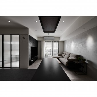
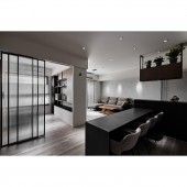
The client is focusing on the public space of the family but does not need a dining table. For this reason, the proportion of the public area is divided into a living room and a sidebar to provide dining and other flexible needs. Besides, the designer uses a variety of techniques in the limited square footage of the space, such as hollowing, suspension, staggered color blocks, moru glass, and iron inserts to create a modern space style. Next, the designer adopted a calm and restrained grayscale color to create a quiet and elegant scene.
OPERATION / FLOW / INTERACTION:
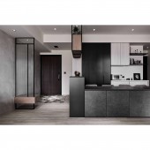
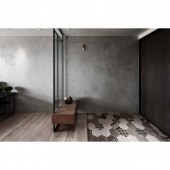
In the limited space, the designer eliminates the obstruction caused by the partition and field transformation in each block. In the entrance, the designer uses hexagonal tiles and stained oak veneer to separate the living room. At the same time, considering Feng Shui, the designer sets up a floating shoe chair and partition. The designer also combines the floating shoe chair to improve the usage of the space.
PROJECT DURATION AND LOCATION:
The project finished in August 2020 in Xinzhuang District, New Taipei City.
FITS BEST INTO CATEGORY:
Interior Space and Exhibition Design
|
PRODUCTION / REALIZATION TECHNOLOGY:
Imported art paints, sheet tiles, hexagonal tiles, aluminum framed doors, rock panels, oak-stained veneers.
SPECIFICATIONS / TECHNICAL PROPERTIES:
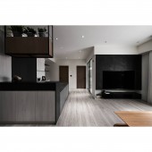
The whole space is shaped by a calm and astringent atmosphere as the main conception. Extending from the grayscale lacquer on the wall, the designer adopted the built-in method for the TV cabinet in the public area and embedded the TV into this cabinet. In the foyer and dining area, the designer adopts inlay woodwork cabinetry with hollow and suspension techniques to lighten the space. Lastly, the designer used grey tones to create a rich layer of changes and extensions to the space.
TAGS:
Stable tone, open space, storage cabinet, smoky gray tones, natural lighting.
RESEARCH ABSTRACT:
The 85-square-meter space is decorated in a calm, restrained black, white, and grey. The public area adopts open space planning. Connects the living room with the dining room and the dining table. Different from the general dining space, to meet the client expectations, the dining seats are arranged vertically on the same side of the table. The shelves are connected to the storage cabinets, while the hanging wooden shelves are designed to create more storage space. As for the private area, continuing the main color tone of the public area, chose neutral colors for these three rooms.
CHALLENGE:
The space is a newly completed house. Under the expectation of the client, how to select the appropriate materials is one of the challenges to the designer. In the kitchen island, the designer uses the tile lamination method to achieve a perfect and aesthetic pavement. The TV cabinet is pre-built with a double-sided cabinet so that one side is a TV wall and the other side is a multi-functional room for storage, which provides a proper and comprehensive application of space at once.
ADDED DATE:
2021-09-23 01:43:05
TEAM MEMBERS (1) :
Spark Wu, Jerry Wu
IMAGE CREDITS:
XING Interior Design
|
