Notter Nuts Premium Gift Sets Packaging by Chuan Yeo |
Home > Winners > #130232 |
 |
|
||||
| DESIGN DETAILS | |||||
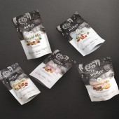
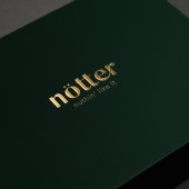
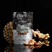
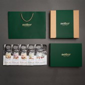
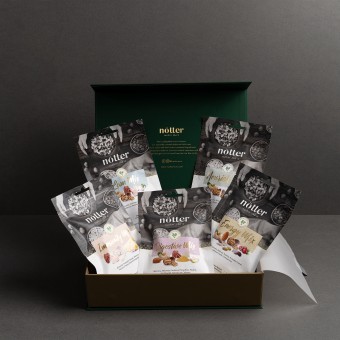
| DESIGN NAME: Notter Nuts Premium Gift Sets PRIMARY FUNCTION: Packaging INSPIRATION: Inspired by the health-food product which is created from 100% natural ingredients, the packaging took on a wholesome, natural look that entices its health-conscious target market. It also had an earthy feel, representative of nature and Nötter’s organic origins. Research was done on the available types of organic food in the market and the type of packaging used. A survey was conducted amongst the health-conscious target market as well as F&B enterprises to support the research done. UNIQUE PROPERTIES / PROJECT DESCRIPTION: A rebranding effort to refresh Nötter’s image to differentiate and pull away from supermarket brands, Nötter products are freshly picked and of high quality, which needed to be told through the packaging. OPERATION / FLOW / INTERACTION: The paperbag and box are designed with premium matt velvet finish complimented with matt gold foil finish to provide a sleek and mysterious approach to the receiver. As they unwrap and unbox the gift set, they will be surprised with the pastel colored packaging within. PROJECT DURATION AND LOCATION: January 2021 in Singapore FITS BEST INTO CATEGORY: Packaging Design |
PRODUCTION / REALIZATION TECHNOLOGY: We looked into the details needed to boost the brand image and consumer experience. Nötter products needed to not only look premium, it also needed to feel premium in hand. Thus the packaging, gift box and paperbag have a velvet lamination finish for a lush velvety feel. The velvet lamination also muted the deep green colour for an added elegance. To make the brand logo pop, 3D emboss was applied on the gold logo for a sophisticated look to increase tactile appeal. SPECIFICATIONS / TECHNICAL PROPERTIES: 290mm x 70mm 220mm TAGS: Health food, Packaging Design, Nuts, Premium Gifts RESEARCH ABSTRACT: Online research on related food items such as other health or organic foods, their packaging, and logistics involved was done to determine which type of materials and aesthetic was most suitable for the product. Surveys via phone call and face-to-face meetings were conducted to support the research. The data was consolidated and channelled to the design team to integrate with the packaging. CHALLENGE: To stand out from the other retail brands of nuts in the market, the packaging was redesigned to be recognised as a premium and wholesome brand. The mixes renamed to convey the consumer benefit upfront. For example, what was previously known as ‘Premium Mix’, was renamed to ‘Immunity Mix’. To increase pick up rate, sets (between 5 – 6 mixes) were introduced and they were packaged together in a premium-looking box, suitable for corporate gifting. ADDED DATE: 2021-09-17 10:31:54 TEAM MEMBERS (3) : Art Director: Norsyafiqah binte Sabaruddin, Art Director: Joseph Chan and Designer: Henny Tjemerlang IMAGE CREDITS: Achates 360 Pte Ltd PATENTS/COPYRIGHTS: Copyrights belong to Achates 360 Pte Ltd |
||||
| Visit the following page to learn more: https://www.notternuts.com/ | |||||
| AWARD DETAILS | |
 |
Notter Nuts Premium Gift Sets Packaging by Chuan Yeo is Winner in Packaging Design Category, 2021 - 2022.· Press Members: Login or Register to request an exclusive interview with Chuan Yeo. · Click here to register inorder to view the profile and other works by Chuan Yeo. |
| SOCIAL |
| + Add to Likes / Favorites | Send to My Email | Comment | Testimonials | View Press-Release | Press Kit |

