NorthYork Design Office by Alex Hsiung |
Home > Winners > #130121 |
 |
|
||||
| DESIGN DETAILS | |||||
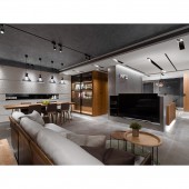
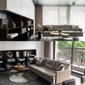
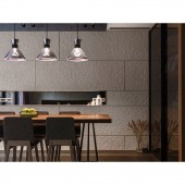
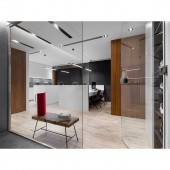
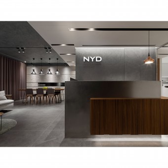
| DESIGN NAME: NorthYork Design PRIMARY FUNCTION: Office INSPIRATION: Instead of superfluous changes in materials, the space features hand-applied paint, natural wood, and mellow stone. All are flooded in natural light. Floor-to-ceiling window offers views of luscious greenery, creating a resort island in the city to get away from the high pressure in the workplace. UNIQUE PROPERTIES / PROJECT DESCRIPTION: Office is a place where you spend more than 8 hours a day. Unlike any traditional and cold look, we hope to create a different office with the theme of humanism and purity. The natural stucco elements, the simple and pure white color, and the low-key fashion style construct a delicate and uncluttered space. The bold use of different materials creates a unique custom-made space through the ingenious design, matching and stacking. OPERATION / FLOW / INTERACTION: The iron surface and veneer form a reception desk, and the floating light below erases the heaviness of the volume. The hand-painted wall in a grayscale base allows the mind to gradually settle into restfulness. With the extension of the reception desk, the lower level is expanded into a TV wall in a longue area. The main wall is based in ink color, and the transition of dark and light colors creates rich layers. The lounge area starts with floor in a grayscale tone and extends horizontally after climbing the facade to an ink-colored display cabinet, which not only mirrors the TV wall but also creates a balance of tension with the white storage cabinets hanging above. The sequential movement leads to the view outside the window, bringing in a bright and transparent vibe.Gray colors extend to the canopy, and the rustic stucco injects a gentle atmosphere into the open meeting area. The undulating stone makes a perfect end view. The glass showcase next to it holds various collections. Under the light source, a space of restrained elegance is created.The transparent glass partition opens the space up. Through a smooth traffic flow, the fields are redefined for them to better connect with each other. PROJECT DURATION AND LOCATION: The project finished in May 2020 in New Taipei City, Taiwan. FITS BEST INTO CATEGORY: Interior Space and Exhibition Design |
PRODUCTION / REALIZATION TECHNOLOGY: Steel brushed veneer, imitate slate texture board, imported floor tiles, metal, non-toxic coating and laminate hard plastic sheet. SPECIFICATIONS / TECHNICAL PROPERTIES: In the space of 100 m², there are counter, meeting area, reception area, working, working space and tea room. TAGS: Interior Design, Office Design, Hand-applied paint, Modern style, Low-chroma colors RESEARCH ABSTRACT: There are no crowded seats and partitions in order to greatly enhance the comfort of the office and the interaction between colleagues. The reception area is open and combined with continuous floor-to-ceiling windows to add the greenery into the room, dissipating the seriousness of the meeting room and adding a pleasant atmosphere to the space. Visitors can talk about the blueprint of their dreams in the most comfortable ambience. CHALLENGE: There are no solid walls separating spaces the transparent glass partition opens the space up. Through a smooth traffic flow, the fields are redefined for them to better connect with each other. Simple color palette spreads throughout the entire office area. Pure color allows ideas to soar freely.The wooden elements on the facade continue the warmth of the reception area, while the brown veneer injects a soft warmth to soften the stiffness and rigidity of the office. ADDED DATE: 2021-09-15 09:13:00 TEAM MEMBERS (1) : Alex Hsiung IMAGE CREDITS: NorthYorkDesign |
||||
| Visit the following page to learn more: http://reurl.cc/NZXGN5 | |||||
| AWARD DETAILS | |
 |
Northyork Design Office by Alex Hsiung is Winner in Interior Space and Exhibition Design Category, 2021 - 2022.· Read the interview with designer Alex Hsiung for design NorthYork Design here.· Press Members: Login or Register to request an exclusive interview with Alex Hsiung. · Click here to register inorder to view the profile and other works by Alex Hsiung. |
| SOCIAL |
| + Add to Likes / Favorites | Send to My Email | Comment | Testimonials | View Press-Release | Press Kit |
Did you like Alex Hsiung's Interior Design?
You will most likely enjoy other award winning interior design as well.
Click here to view more Award Winning Interior Design.


