Feather Residence by Page Li |
Home > Winners > #129869 |
 |
|
||||
| DESIGN DETAILS | |||||
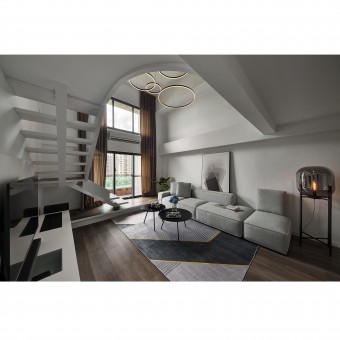
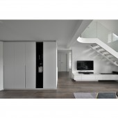
| DESIGN NAME: Feather PRIMARY FUNCTION: Residence INSPIRATION: With the strong belief of how a clear space can uplift the spirit, the designer clears out the busy layout, intuits the flow and neutralizing the lighting and the tones, so that the residents can return to a comfy home to relax. UNIQUE PROPERTIES / PROJECT DESCRIPTION: To relief the oppression from low ceiling and complex partitions, and to break through the tradition layout, the designer transforms the originally two-story building into an open plan maisonette, therefore creates a cozy, tidy living space with smooth flow and fluidity. The neat lines with a cohesive black and white color palette together build a pure space and visual enjoyment. OPERATION / FLOW / INTERACTION: The gap between the living room and the balcony is now filled with a slightly lifted floor, the additional height also extends to the stairs, eliminating the inconvenience an uneven floor might bring. The stairs are adjusted into a meanderer style, which elongates the sight and creates a fluidity. PROJECT DURATION AND LOCATION: This project finished in June 2021 in Taoyuan City, Taiwan FITS BEST INTO CATEGORY: Interior Space and Exhibition Design |
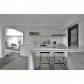
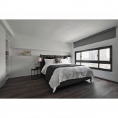
PRODUCTION / REALIZATION TECHNOLOGY: The flooring and the coating of the walls all over the space are all green materials. With enough linear lightings to light up the space efficiently, no redundant light sources are required. This not only deduces the energy consuming, but also maximizes the value of things through design. Due to the maisonette layout, the designer introduces smart light switches to the house for the residents to live a more convenient live while minimizing the unnecessary waste. SPECIFICATIONS / TECHNICAL PROPERTIES: The project is 110.6 square meter. TAGS: Interior, Two-story, White, Cozy, Relax RESEARCH ABSTRACT: The common area on the first floor consists of the entrance, the living room, the kitchen and the dining room. The light wooden floor panels all going over the area, contrasting the white from the walls, ceiling and the cabinets, stabilize the space and create a visual focus while the lightness lifts the space. Instead of a fully open plan, the subtle color change between the kitchen and the living room cleverly draws the lines between tow areas without creating any barrier. CHALLENGE: The attention to details is on point, not only does the designer simplify the visual through colors and textures, he also adds in embedded lights to the lower beams, the seams of the ceiling, and the edge of the cabinets. With the lighting, the defects of the space are embellished, and also interesting visual effects come with the changes of light and shadow. ADDED DATE: 2021-09-03 06:28:53 TEAM MEMBERS (3) : Designer: Page Li, Designer: Zhen-Hua Zhu and IMAGE CREDITS: Image #1-5: Photographer Ji-Shou Wang, Feather, 2021. |
||||
| Visit the following page to learn more: https://www.hoholistic.com/home | |||||
| AWARD DETAILS | |
 |
Feather Residence by Page Li is Winner in Interior Space and Exhibition Design Category, 2021 - 2022.· Read the interview with designer Page Li for design Feather here.· Press Members: Login or Register to request an exclusive interview with Page Li. · Click here to register inorder to view the profile and other works by Page Li. |
| SOCIAL |
| + Add to Likes / Favorites | Send to My Email | Comment | Testimonials | View Press-Release | Press Kit |
Did you like Page Li's Interior Design?
You will most likely enjoy other award winning interior design as well.
Click here to view more Award Winning Interior Design.


