|
|
|


|
|
| DESIGN DETAILS |
DESIGN NAME:
Iguana
PRIMARY FUNCTION:
Energy Drink Packaging
INSPIRATION:
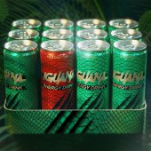
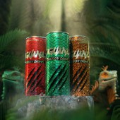
The very name of the product Iguana and the use of natural ingredients inspired the use of natural images, to show the jar that imitates the skin of the Iguana. The color of the skin changes depending on the taste. The original taste is - Green skin. Tropical flavor - orange/gold. Red Berries - Red Leather shows explosive scratches on this leather. They give a sense of the power and explosive effect that nature can give.
UNIQUE PROPERTIES / PROJECT DESCRIPTION:
Iguana Energy composition is perfectly balanced. All components perfectly complement each other, creating the energetic effect. All ingredients used in the production of Iguana are natural, giving the taste of invigorating explosive energy and strength!
OPERATION / FLOW / INTERACTION:
Custom design will make the product stand out on the shelf.
PROJECT DURATION AND LOCATION:
The project started in March 2021 in Lviv and ended in October 2021 in Lviv.
FITS BEST INTO CATEGORY:
Packaging Design
|
PRODUCTION / REALIZATION TECHNOLOGY:
Designs are printed on the aluminum and then crafted into a can
SPECIFICATIONS / TECHNICAL PROPERTIES:
оriginal
Classic taste of invigorating energy
tropical fruits
Bright fruity taste with notes of citrus, designed to awaken your fire.
red berries
Perfect charge of berry energy
TAGS:
iguana, Energy drinks, can, Leather, scratches
RESEARCH ABSTRACT:
The customer came already with the name Iguana. Our agency had to develop the design of a power bank in three forms. Were offered several options, more simple and concise. And immediately the first option was conceived in the form of skin, the skin of an Iguana. this idea came up on its own. For even greater manifestation and identity, it was the power engineer who was asked to make scratches in the bank, which give a feeling of strength, energy. The font was proposed in the nature of scratches, so that the style would be solid. The contrast of the black-and-white font and bright colored skin makes the writing stand out well. several colors of skin were suggested on the jar depending on the type of flavor. There are three in total.
CHALLENGE:
It was necessary to model an iguana and pick up the skin.
ADDED DATE:
2021-09-01 10:49:10
TEAM MEMBERS (2) :
Art-Director and graphic designer: Lynnyk Dmytro and Designer 3D: Alexey Avduevsky
IMAGE CREDITS:
Linnikov Agency, 2021.
|
| Visit the following page to learn more: https://linnikov.agency/en/portfolio/iguana/ |
|
| CLIENT/STUDIO/BRAND DETAILS |
 |
NAME:
Iguana
PROFILE:
Energy drinks.
The company produces non-alcoholic energy drinks. Line contain 3 different flavors.
After a long 5-year pause, the company returns to the market with a new brand positioning and a new design, which was created by the Linnikov branding agency.
|
|
|
| COMMENTS |
| Giulia Esposito |
Comment #14619 on December 27, 2022, 8:52 pm |
|
As a design enthusiast, I am truly impressed by this work. The creative use of colors and shapes to create a unique and eye-catching packaging design for an energy drink is outstanding. It is clear that a lot of thought and effort has gone into the design of this packaging, resulting in a product that is aesthetically pleasing and memorable. I am also very impressed with the attention to detail that has been given to the design, from the choice of materials to the way the packaging has been constructed. This energy drink packaging is truly a work of art and a great achievement. Congratulations to Linnikov Agency for their award-winning work!
|
| Paul Williams |
Comment #63070 on January 3, 2023, 11:31 pm |
|
Iguana is an outstanding example of packaging design excellence. The creative use of natural imagery to represent the unique composition of the energy drink is a brilliant concept. The vibrant colors of the iguana skin, coupled with the explosive scratches on the jar, perfectly capture the invigorating and energizing effect of the drink. The contrast between the black and white font and the bright colors of the jar further accentuate the power and strength of the drink. The detailed research, modeling and crafting of the jar into a can is a testament to Linnikov Agency’s exceptional design skills and creativity. Congratulations to Linnikov Agency for winning the A' Design Award for Packaging Design with Iguana!
|
| Paul Phillips |
Comment #73982 on January 4, 2023, 4:36 am |
|
I am simply amazed by the energy drink packaging design of "Iguana". The perfect balance of the components truly creates an invigorating, explosive energy and strength. It is also a great plus that the ingredients used in the production of the drink are all natural. This design is truly a celebration of creativity and a triumph of good design. It is no wonder it was awarded the A' Design Award!
|
| Elena Petrenko |
Comment #77341 on January 4, 2023, 6:15 am |
|
Linnikov Agency's award-winning Iguana energy drink packaging is an inspired design that perfectly captures the energetic, explosive effect of its natural ingredients.
|
| Adam Harris |
Comment #84262 on January 4, 2023, 10:55 am |
|
I am absolutely in awe of the creative and innovative design that is Iguana Energy Drink Packaging. The perfect balance of components and the use of natural ingredients to create an explosive energy and strength effect is truly remarkable. The visual interpretation of the iguana's skin with color changes depending on the taste is an incredible display of artistry and craftsmanship. The unique use of scratches to give the feeling of strength and energy is an inspired and clever idea that gives the packaging a powerful identity. The design from Linnikov Agency is a perfect example of what can be achieved through research, creativity and innovation.
|
| Chloe Turner |
Comment #90573 on January 4, 2023, 5:06 pm |
|
I am so impressed by this energy drink packaging design! What a creative way to represent the product’s inspiration. Using different colors to indicate the flavors is a great visual touch and the scratches and texture on the jar are a perfect way to represent the explosive power of nature. This design is stylish, eye-catching and memorable – a true testament to the skill and creativity of the designer.
|
| Elisabeth Clark |
Comment #93705 on January 4, 2023, 8:54 pm |
|
I'm absolutely in awe of Linnikov Agency's work on Iguana. Not only did they develop an energy drink packaging that perfectly balances all of its components, but they also managed to make it stand out with their creative use of natural imagery. The idea of imitating the skin of an Iguana was truly inspired, and the colors used for each type of flavor make the design even more eye-catching. The font chosen to contrast the bright colors of the skin also adds to the overall look. Overall, the entire design is incredibly intricate and well-thought-out, and truly deserves to be recognized with this award.
|
|
|
Did you like Linnikov Agency's Packaging Design?
You will most likely enjoy other award winning packaging design as well.
Click here to view more Award Winning Packaging Design.
Did you like Iguana Energy Drink Packaging? Help us create a global awareness for good packaging design worldwide. Show your support for Linnikov Agency, the creator of great packaging design by gifting them a nomination ticket so that we could promote more of their great packaging design works.
|
|

|
|
|
|


