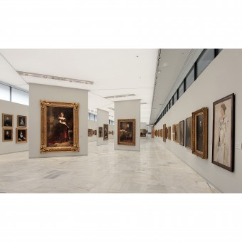
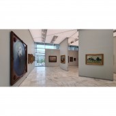
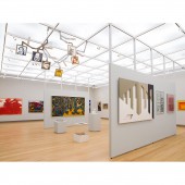
National Gallery Athens Museum by Parmenidis Longuepee Mari Team |
Home > Winners > #129529 |
| CLIENT/STUDIO/BRAND DETAILS | |
 |
NAME: National Gallery of Greece PROFILE: The National Gallery Athens, Greece, is an art museum, devoted to Greek and European art from the 14th century to the 20th century. It is also known as the Alexandros Soutsos Museum, after the gallery’s most prominent benefactor. It stands out particularly for its nineteenth and twentieth century Greek painting and sculpture collection. When it was first established in 1878, the art gallery had a collection of 117 paintings exhibited at the Athens University. In 1896, Alexandros Soutsos bequeathed his collection and estate to the Greek Government aspiring to the creation of an art museum. The museum opened in 1900 which grew year after years thanks to private donations. After World War II the works began for a new Modern Movement building. After relocating the sculptures in the new National Glyptothek, the main building has renovated, and a new wing has added. The newly renovated building reopened after an 8-year refurbishment, on 24 March 2021, a day before the 200th anniversary of the Greek War of Independence. Nowadays, it displays approximately 20,000 works of art by Greek and European artists. It is directed by prof. Marina Lambraki-Plaka. Approximately four million people have visited the National Gallery in the last fourteen years. Its exhibition activity is mainly supported by sponsorships that cover up to half of its budget. The National Gallery has opened the last years branches in Nafplion, Sparta and Corfu. |
| AWARD DETAILS | |
 |
National Gallery Athens Museum by Parmenidis Longuepee Mari Team is Winner in Interior Space and Exhibition Design Category, 2021 - 2022.· Read the interview with designer Parmenidis Longuepee Mari Team for design National Gallery Athens here.· Press Members: Login or Register to request an exclusive interview with Parmenidis Longuepee Mari Team. · Click here to register inorder to view the profile and other works by Parmenidis Longuepee Mari Team. |
| SOCIAL |
| + Add to Likes / Favorites | Send to My Email | Comment | Testimonials | View Press-Release | Press Kit |
Did you like Parmenidis Longuepee Mari Team's Interior Design?
You will most likely enjoy other award winning interior design as well.
Click here to view more Award Winning Interior Design.


