The Wine Barrel Dilemma Packaging by Antonia Skaraki |
Home > Winners > #129353 |
 |
|
||||
| DESIGN DETAILS | |||||
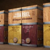
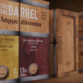
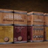
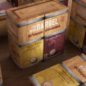
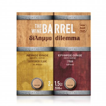
| DESIGN NAME: The Wine Barrel Dilemma PRIMARY FUNCTION: Packaging INSPIRATION: There are a lot of dividing opinions, even between good friends. A lot of times having a good time with company relies on decisions between choices, dilemmas. Our mission was to solve the problem of wine choosing, a very common dilemma found amongst most friendly gatherings, while, simultaneously, reversing the established idea that quality wine can only exist in a glass container. UNIQUE PROPERTIES / PROJECT DESCRIPTION: This project’s highlight was managing to make TheWineBarrelDilemma OPERATION / FLOW / INTERACTION: The consumer is now able to buy and enjoy a packaging consisting of both red and white wine, without having to choose one over the other. This packaging applies perfectly to gatherings and parties. PROJECT DURATION AND LOCATION: The Project started in April 2020 and is still ongoing |
PRODUCTION / REALIZATION TECHNOLOGY: TheWineBarrel offers an easy to carry handle, allowing it to become a perfect gift for visiting friends or family, while its tap makes serving as simple as pouring water on a glass. SPECIFICATIONS / TECHNICAL PROPERTIES: - TAGS: Wine_Barrel, wine, Packaging, Design, Barrel, Dilemma, red, white, cellar, out_of_the_box RESEARCH ABSTRACT: There are a lot of dividing opinions, even between good friends. A lot of times having a good time with company relies on decisions between choices, dilemmas. Our mission was to solve the problem of wine choosing, a very common dilemma found amongst most friendly gatherings, while, simultaneously, reversing the established idea that quality wine can only exist in a glass container. CHALLENGE: The wooden wine barrel is converted to the main reference point of the brand, which differentiates it from the competition. Robust and absolute typography, special symbols, pyrographic markings, and handwritten elements transport the consumer to an imaginary cellar. In his own barrel. In the world of The Wine Barrel. The color palette and the different symbolisms clearly separate the 4 product codes on the shelf, but retaining the "common denominator" of the relevant design. ADDED DATE: 2021-08-02 12:23:54 TEAM MEMBERS (2) : Creative Director: Antonia Skaraki and Art Director: Andreas Deskas IMAGE CREDITS: Image #1: Photographer Andreas Deskas Image #2: Photographer Andreas Deskas Image #3: Photographer Andreas Deskas Image #4: Photographer Andreas Deskas Image #5: Photographer Andreas Deskas Video Credits: Chris Gerokostas |
||||
| Visit the following page to learn more: https://www.antoniaskaraki.com | |||||
| CLIENT/STUDIO/BRAND DETAILS | |
 |
NAME: THE WINE BARREL PROFILE: - |
| AWARD DETAILS | |
 |
The Wine Barrel Dilemma Packaging by Antonia Skaraki is Winner in Packaging Design Category, 2021 - 2022.· Read the interview with designer Antonia Skaraki for design The Wine Barrel Dilemma here.· Press Members: Login or Register to request an exclusive interview with Antonia Skaraki. · Click here to register inorder to view the profile and other works by Antonia Skaraki. |
| SOCIAL |
| + Add to Likes / Favorites | Send to My Email | Comment | Testimonials | View Press-Release | Press Kit |
Did you like Antonia Skaraki's Packaging Design?
You will most likely enjoy other award winning packaging design as well.
Click here to view more Award Winning Packaging Design.


