DESIGN NAME:
DHL Red and Yellow
PRIMARY FUNCTION:
Office
INSPIRATION:
While discussing the inspiration for this project, the design drawn to the brand’s colors, the red & yellow.
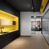
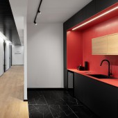
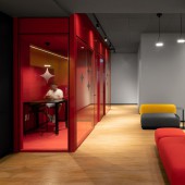
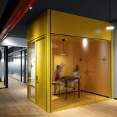
Gathering elements, whether it was the containers, shipping boxes or the horizontal lines in the logo. All of it came together to form the design for this project. The design walks the user through the project whether it is in the "red, or yellow boxes" used as phone booths, or as coffee dots, the working station, etc.
You simply can't miss the fact that these are DHL offices.
UNIQUE PROPERTIES / PROJECT DESCRIPTION:
The design scheme for this project started from the working area. There was a strong need to create a wellbeing environment and to find a way to unite the various departments.
Getting started from the small detail using the same design language helped to create sense of belonging.
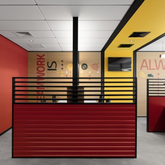
The DHL spirit can be felt even at the working station using a carved red partition implied to containers mixed with the brand graphic language and yellow PET panels.
OPERATION / FLOW / INTERACTION:
Common to all departments was on one hand, the demand for team-work, and on the other hand, there was a real need to solve the acoustic problem created in the space. The use of PET panels in all the workspaces and thus created the uniformity. The use of these panels as a branded wall cladding in the company's red and yellow colors and in its graphic language allowed us to create a unifying design sequence under the chosen line.
Continuing this line in the public space as well, despite the differences, created an office that is all about uniformity
PROJECT DURATION AND LOCATION:
The project started in March 2020 and finished in July 2021
7000 sqm locate in Shoam industrial area near Ben Gurion airport
FITS BEST INTO CATEGORY:
Interior Space and Exhibition Design
|
PRODUCTION / REALIZATION TECHNOLOGY:
The requirements were to create a young dynamic colorful design but elegance and clean. The inspiration for designing the open space working station came from the Neoplasticism a theory formulated by Mondrian. This theory advocated in composition of right angles in vertical and balanced lines, primary colors- red, yellow, and blue or in not true colors- black, white, and grey. The use of black metal right angle's structure combined with yellow PET, boxes or white bords in the main partition, and the use of black aluminum fence mixed with red color wood carved panel at the edges assimilated the idea.
SPECIFICATIONS / TECHNICAL PROPERTIES:
-
TAGS:
-
RESEARCH ABSTRACT:
-
CHALLENGE:
This project started in March 2020 at the same time as Covid 19. To design and plan 7000 sqm with the client via Zoom was most challenging. The approval of the design with the bord via zoom meetings, or the need to Create a 3d model for all the project and for all details to enable to illustrate the space that was designed. The manufacturers schedule or production line changes some time with sort notes, or the need to deal with Clasps, insulations, social distance, or masks was unexpected but it was done and with a smile.
ADDED DATE:
2021-07-31 23:28:26
TEAM MEMBERS (1) :
IMAGE CREDITS:
Image #1 : Photogrpher Gidon Levin
Image #2 : Photogrpher Gidon Levin
Image #3 : Photogrpher Gidon Levin
Image #4 : Photogrpher Gidon Levin
Image #5 : Photogrpher Gidon Levin
|


