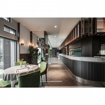
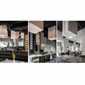
Elegance Restaurant by Jacksam Yang |
Home > Winners > #129030 |
| CLIENT/STUDIO/BRAND DETAILS | |
 |
NAME: YHS DESIGN ARCHITECTURE INTERIOR DESIGN PROFILE: YHS DESIGN is a diverse construction / interior design company, which design works present various thoughts of design aspects and the abundant of East-West cultural confluence. Architectural design shows respect the surrounding environment for the land and the issues; respect the basic texture and material properties, then give a brand new interpretation. Professionally good at architecture and implanted lots natural landscape elements in interior, which constitute "light, screen shadow, wind, water flow," intertwined. Interior design is from the popular and trend semiotics brewing a unique aesthetic sensitivity, and transformed into an easily interpreted language. Also combined with patterns, lines, materials, edge, cutting, accessories to furnishings, which are all integrated in the overall plan and design, presents not only the beauty of space, but the request for the details. |
| AWARD DETAILS | |
 |
Elegance Restaurant by Jacksam Yang is Winner in Interior Space and Exhibition Design Category, 2021 - 2022.· Read the interview with designer Jacksam Yang for design Elegance here.· Press Members: Login or Register to request an exclusive interview with Jacksam Yang. · Click here to register inorder to view the profile and other works by Jacksam Yang. |
| SOCIAL |
| + Add to Likes / Favorites | Send to My Email | Comment | Testimonials | View Press-Release | Press Kit |
Did you like Jacksam Yang's Interior Design?
You will most likely enjoy other award winning interior design as well.
Click here to view more Award Winning Interior Design.


