DESIGN NAME:
The Depth of Space
PRIMARY FUNCTION:
Residential
INSPIRATION:
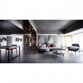
We hope to give new depth meanings to the space, reorganize the plane and redefine the lighting axis; deliver a rich visual sense through different light and shadow angles, and expand the vitality within the low-limit area. Using clear sight to measure space ratio, Yui Designs has reorganized the original spatial that was multi-cut; special paints with changing layers are used at the ceiling dome to create an oil painting visual depth of field. With the sunlight from the north and west, layers of emotions are built up to deliver a free traffic flow and vitality.
UNIQUE PROPERTIES / PROJECT DESCRIPTION:
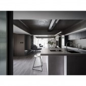
Reorganized the spatial using a T shape as the base of the traffic flow design while combing the progressive light and shadow effects of the north and west natural sunlight. To solve the original roundabout, narrow and multi-compartment situation, consider the demands of the changes of family members and lifestyles and replaced the actual private area with the master bedroom and the secondary bedroom; while hoping to offer the client and pets an expansive and free traffic flow. Based on those needs, the designer designed the ceiling with an open-ended design.
OPERATION / FLOW / INTERACTION:
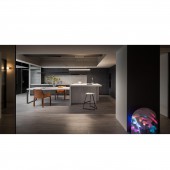
The designer applied a T-shaped spatial design to rearrange the original roundabout and divided space, also used the lightings of the west and north windows to solve dim issues. With the strong and weak layers of lights and shadows, scenery emotions for each area are created. The study that is located at the depths of the structure is not only being used as a scenic view; the designer used both sides of the sliding door that allow users to function more conveniently and freely.
PROJECT DURATION AND LOCATION:
The project finished in 2020 in Taiwan.
FITS BEST INTO CATEGORY:
Interior Space and Exhibition Design
|
PRODUCTION / REALIZATION TECHNOLOGY:
Italy-imported special paints, wooden-grained tiles, mirrors, hardware, Italy-imported unique stone slates, titanium-plated steel slates, Chang Hong glasses
SPECIFICATIONS / TECHNICAL PROPERTIES:
The design area is around 40 ping, including the public area: the living room, the dining room, the resting area, and the private area: the master bedroom, the secondary bedroom, the bathing space, and the study.
TAGS:
depth and tense of life, transparent, expanded the visual space, light and shadow gradients
RESEARCH ABSTRACT:
Using a T-shape as the base of public traffic flow planning, the sunlight from both sides of the windows has outlined a progressive space depth. At the same time, the designer applied the open-ended designing method and the cohesion ratio of different materials that combine light and shadow gradients to achieve a smooth and free traffic flow while connecting emotions from both sides. To improve the original low ceiling that caused visual pressure, the designer opened up the ceiling area using oil painting-like special paints as the main body of the structure.
CHALLENGE:
How to present a more penetrating visual effect in the space is the designer priority consideration and challenge in the space modification. Due to the changes of the client family members, the original three-bedroom cubicle has become a historical memory that needs to be adjusted slightly. Considering the activity habits of the three members of the family members and the two pets, in this case, the designer arranged the original roundabout and separated space as a freer, more penetrating line of life.
ADDED DATE:
2021-06-30 10:34:10
TEAM MEMBERS (1) :
Hung-Yu Chen, Yi-Chia Kao
IMAGE CREDITS:
Yu [ i ] Design Studio
|


