DESIGN NAME:
Yamaki Zushi
PRIMARY FUNCTION:
Restaurant
INSPIRATION:
Aesthetics and simplicity develop this design concept. The spatial is divided by rough and delicate methods inside out, allowing users to experience different atmospheres between the transformation of areas.
UNIQUE PROPERTIES / PROJECT DESCRIPTION:
First, the restaurant exterior is made of hardware in the shapes of weatherboard inspired by Japanese wooden weatherboards; the vintage-like facade appearance has created a sense of roughness through the added layers. Old materials are reused by continuing the original red brickwork technique from the former restaurant to this new space; yet, wooden bricks are applied instead of red bricks and have inherited the collage characteristics of the original design. The red brickwork and weatherboard designs have transferred the imagery and atmosphere of the former shop while adding a sense of Japanese.
OPERATION / FLOW / INTERACTION:
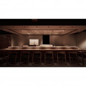
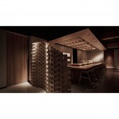
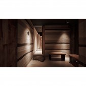
The overall spatial is mainly divided into two dining areas. One is the open-end counter area that contains twelve seats; these seats surround the cooking station. The square-shaped arrangement has echoed with the wooden diagonal planes on the disordered ceiling; also, the wooden tile screens have all together shown a peaceful atmosphere in the same tones. The other seating area is designed as private boxes; the steady, low-key wooden materials surround the seats with hardware screens.
PROJECT DURATION AND LOCATION:
The project finished in May 2021 in Taiwan.
FITS BEST INTO CATEGORY:
Interior Space and Exhibition Design
|
PRODUCTION / REALIZATION TECHNOLOGY:
Rusted iron, unpainted wood, cypress, teak, rock-imitated materials, Cadoni flooring, Baizou, rocks.
Baizou is a material recycled from volcano ashes in Japan. It could eliminate formaldehyde while decreasing moisture and smells.
SPECIFICATIONS / TECHNICAL PROPERTIES:
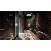
The interior is built on the core of (the co-existence of men and nature). It has outlined the sense of (rough rustic) through the Karesenzui-like cement walls, shale-like materials, fish pond, tree sceneries, and atrium. At the same time, many wooden materials are applied for a spatial extension, creating the maximum richness in low-convergence changes of materials. The interior is decorated with gratings and window flaring that connected the Karesenzui landscaping at the entrance, practicing the core of this spatial design concept.
TAGS:
Dining space, Japanese, eco-friendly materials, Karesenzui, cypress.
RESEARCH ABSTRACT:
The exterior is built in a rain staircase shape with rust-imitated materials; the use of vintage-like materials has intentionally given guests the first impression of roughness. After entering the interior, a dark-grey Karesenzui scenery shows up, and the dark-toned space has used an atrium method to draw daylight from outdoors. An open-end dining area and VIP boxes are introduced after the hallway; different materials in the same tone are applied to create a spatial extension. Unordered layers are created using cypress, unpainted woods, teak, rock-imitated materials, and Cadoni flooring.
CHALLENGE:
With the advantage of free deployment, how to combine the client requirements with spatial arrangements to create a smooth traffic flow for employees and customers was one of the critical issues of this design. Finally, the designer mixed the overall structure with materials and construction method; combining different materials in the same tone such as cypress, unpainted wood, and teak with Baizou allows the space to decompose residual smells of cooking effectively.
ADDED DATE:
2021-06-30 10:28:41
TEAM MEMBERS (1) :
Yu-Fan Kao, Wei-Hua Lin
IMAGE CREDITS:
DRAWIN DESIGN STUDIO
|


