Loacker Rebrand Packaging by Marco Ventrice |
Home > Winners > #127989 |
 |
|
||||
| DESIGN DETAILS | |||||
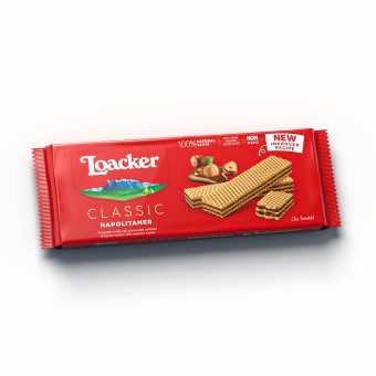
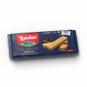
| DESIGN NAME: Loacker Rebrand PRIMARY FUNCTION: Packaging INSPIRATION: Loacker is not just a brand, is a family name. Furthermore Loacker is on the territory, actually it is the territory. From these considerations, the logo in the shape of a coat of arms was born, onto which the Mt. Sciliar has been incorporated: it is the Heritage Shield, inspired by the historical Loacker crest, which exhaustively expresses the essence of the brand, family name, roots and nature. A life philosophy that started in 1925 when Alfons Loacker settled to build his plant at 1000 meters of height. UNIQUE PROPERTIES / PROJECT DESCRIPTION: After nearly three years of work and consultancy, it finally showed a new rebranding and system pack design in favor of the historical company Loacker. Each family product has been delineated, underlining the recipe and the quality of the ingredients, additionally the architecture of the brand and the products have been redefined. On every referee we have recounted the historic claim Che bontà and on the back of the pack, the QR code redirects to the storytelling regarding the brand and the specified item. OPERATION / FLOW / INTERACTION: Spider has faced the challenge using our own method, by joining creative thought and strategic thinking. The agency has interviewed the Company multiple times, a chat with consumers and then suppliers. Spider has analyzed all sources: packagings shapes, products structure and their distinctive features. All maps have been gathered: conceptual ones, brand architecture maps and competitors’ charts. PROJECT DURATION AND LOCATION: The project started in September 2018 between Torino and Bolzano, and finished in 2021. FITS BEST INTO CATEGORY: Packaging Design |
PRODUCTION / REALIZATION TECHNOLOGY: Classic and Quadratini: rotogravure internal printing on laminated foil substrate. Classic Multipack and Premium Patisserie: Offset printing over cardboard substrate. SPECIFICATIONS / TECHNICAL PROPERTIES: different sizes TAGS: Loacker, brand, creative, branding, logo, packaging, design, rebrand, redesign, food, wafer, chocolate RESEARCH ABSTRACT: Spider did involve the Loacker Team to evaluate the over 200 references and for purposes of rationalization of all ranges; a definition for all categories was offered, along with one for each different positioning. The outcome of this work are various paths grounded on different strategic approaches and then declensed on reference of representation. The most efficient proposals have been tested with 5 iconic products and then verified by means of neuroscience, for instance measuring the attentionality of the consumers’ glance on the shelves, on the products and on the packaging zone. Afterwards, a POS market test followed, until the achievement of a final choice, the one consumers are used to see every day on the large scale distribution racks. CHALLENGE: The requirement Loacker had for the agency, was to communicate on the packs the recipe changeover, highlighting the product new pluses and also by increasing the brand perception, the aim was to find the right balance between the new brand vertical integration and the distinction among the diverse product lines. Following many meetings it has been commonly decided to go beyond the starting brief, which lead Spider to the definition of a global strategy, through rebranding till the establishment of a pack system for each product line and up to the communication of every POS. ADDED DATE: 2021-06-29 13:53:17 TEAM MEMBERS (1) : Spider Adv, Loacker Team IMAGE CREDITS: All food images were realized featuring studio PiùLuce. |
||||
| Visit the following page to learn more: https://www.spideradv.it/en/loacker/ | |||||
| AWARD DETAILS | |
 |
Loacker Rebrand Packaging by Marco Ventrice is Winner in Packaging Design Category, 2021 - 2022.· Read the interview with designer Marco Ventrice for design Loacker Rebrand here.· Press Members: Login or Register to request an exclusive interview with Marco Ventrice. · Click here to register inorder to view the profile and other works by Marco Ventrice. |
| SOCIAL |
| + Add to Likes / Favorites | Send to My Email | Comment | Testimonials | View Press-Release | Press Kit |
| COMMENTS | ||||||||||||||||||||||||||||||||
|
||||||||||||||||||||||||||||||||
Did you like Marco Ventrice's Packaging Design?
You will most likely enjoy other award winning packaging design as well.
Click here to view more Award Winning Packaging Design.


