DESIGN NAME: Sunac Guangshen Longshan
PRIMARY FUNCTION: Commercial Town
INSPIRATION: Since the Internet has spawned rapid development of consumption mode, the sales center has gradually changed from a single model to a functional space that meets the needs of community public services; the service relationship with customers has also transitioned from split-level services to parallel services. Inspired by continuous communication and feedback from customers, it provides new operating concepts for community public spaces.
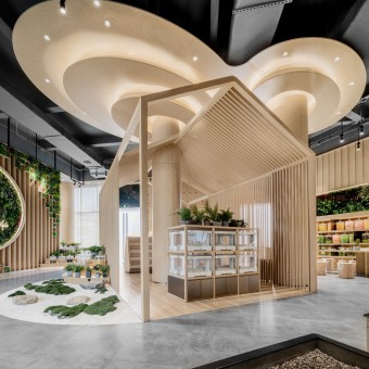
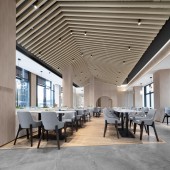
UNIQUE PROPERTIES / PROJECT DESCRIPTION: Centered on users and communities and combined with the differentiated needs of customers and venues, the designer has made a new definition of a new generation of composite scenes, creating an experienced model that outputs a happy business town with the vegetable pavilion and canteens. It is an innovative model for urban community operations and public spaces, which realizes the iteration from scenes to reality.
OPERATION / FLOW / INTERACTION: The traffic line of the entire space is guided by the overlapping relationship of spatial shape and volume. From form to material, the interweaving of line and surface gives the space a radical and straightforward expressive force, interpreting delicate emotions in peace.
PROJECT DURATION AND LOCATION: The project finished in May 2020, in Qingyuan, China.
FITS BEST INTO CATEGORY: Interior Space and Exhibition Design
|
PRODUCTION / REALIZATION TECHNOLOGY: In the selection of materials, the designer mainly uses local materials such as soil, green plants, and wood, and makes a breakthrough in new combinations and collocations between different materials, which are transformed into perceptible objects here.
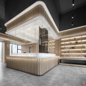
SPECIFICATIONS / TECHNICAL PROPERTIES: The enclosed arrangement promotes interaction. The walkway is set around the display shelf, which forms a new level of space, further extending the interaction of the space. The linear elements connecting the facade and the spatial shape are arranged in an orderly manner, creating a reasonable movement around the interior, making the original simple lines a just right embellishment.
TAGS: interior design, restaurant, wood, light color, commercial
RESEARCH ABSTRACT: Vision is the first impression of space. The uniform materials and colors bring depth, confidence, and infinite possibilities. The designer hides the private room behind the arch, reflecting the black chandelier, hiding the low luxury in the simplicity.
CHALLENGE: Different functional sections can penetrate each other through this soft and coherent interface, which are cut into pieces, distributed, and connected in the form of scenes, adding more stops and creating an unexpected rhythm. Interaction and experience are not isolated by the scene but constantly transform and continue the association.
ADDED DATE: 2021-06-27 05:28:13
TEAM MEMBERS (1) : Judesign
IMAGE CREDITS: Judesign, 2021.
|