|
|
|


|
|
| DESIGN DETAILS |
DESIGN NAME:
Sakura Shimizu
PRIMARY FUNCTION:
Packaging
INSPIRATION:
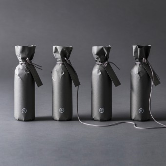
This package was created as part of a branding project for a floral artist. In order to accentuate the color and beauty of the flowers themselves, we created all of the brand's tools in a uniform gray color. This gray is a brand color that gives consumers an image of dignity and quality, but does not detract from the flowers themselves.
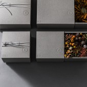
The achromatic flower boxes and paper bags allow the vivid colors of the flowers to stand out. I designed the product to best showcase the artist's work.
UNIQUE PROPERTIES / PROJECT DESCRIPTION:
This package was created as part of a branding project for a floral artist. In order to highlight the color and beauty of the flowers themselves, all of the brand's tools were kept in gray. This gray is a brand color that gives consumers an image of dignity and quality, but does not detract from the flowers themselves.
The achromatic flower boxes and paper bags allow the vivid colors of the flowers to stand out. I designed the product to best showcase the artist's work.
OPERATION / FLOW / INTERACTION:
The flower box is sleeved so that it can be taken out and displayed as it is. It is designed to harmonize with the purchaser's own home decor. The entire jar of the herbarium gift is covered with gray paper so that the inside cannot be seen. The herbarium gift is designed so that when the recipient opens the wrapping, he or she will be impressed by the vivid colors of the flowers.
PROJECT DURATION AND LOCATION:
It has been in use since June 2018 in Sapporo, Japan.
FITS BEST INTO CATEGORY:
Packaging Design
|
PRODUCTION / REALIZATION TECHNOLOGY:
In order to directly express Sakura Shimizu's sincere attitude toward flowers, we designed a symbol using the typography of the Chinese character for "花” This character means flower. We kept the shape simple so as not to interfere with the floral art, which is the star of the show, and we cut down on the elements until they were just barely legible.
SPECIFICATIONS / TECHNICAL PROPERTIES:
Paper bag (large), Width 275mm x Depth 265mm x Height 215mm
Paper bag (small), Width 205mm x Depth 195mm x Height 215mm
Box (large),Width 250mm x Depth 250mm x Height 110mm
Box (small), Width 180mm x Depth 180mm x Height 110mm
Box (long), Width 645mm x Depth 120mm x Height 104mm
Herbarium Gifts, Width 69mm x Depth 69mm x Height 211mm
TAGS:
Flower artist, florist, branding, floral gifts, floral packaging
RESEARCH ABSTRACT:
The logos of Japanese floral artists and florists are very often made with flowers and plants as motifs and in English letters. Many of them are also designed using the bright colors of the flowers as the motif. In order to differentiate ourselves from these marks, we dared to use the typography of Japanese letters as a symbol to create a straightforward and graceful design as a Japanese artist.
CHALLENGE:
We created all kinds of brand tools such as store cards, postcards, wrapping paper, etc., using the typography of Japanese characters as the brand symbol. This kanji symbol impressed consumers with Sakua Shimizu's status as a Japanese floral artist. By using the kanji symbol, Sakua Shimizu succeeded in conveying an imposing brand image as one of Japan's leading flower artists.
ADDED DATE:
2021-06-24 04:48:11
TEAM MEMBERS (3) :
Creative Director:Hitoshi Kobayashi, Art Director:Nobuya Hayasaka and Designer:Nobuya Hayasaka
IMAGE CREDITS:
Nobuya Hayasaka, 2021.
|
| Visit the following page to learn more: http://zwoo.jp/ |
|
| CLIENT/STUDIO/BRAND DETAILS |
 |
NAME:
arica design inc.
PROFILE:
This firm is a design production company specializing in advertising and branding. They plan, design, and produce a wide range of products, from concept design to logos, videos, web, interior design, packaging, and more. Because they can art direct entire brands, they are able to provide consistent and unified designs.
|
|
|
| COMMENTS |
| Giulia Esposito |
Comment #14422 on December 27, 2022, 7:46 pm |
|
As a design enthusiast, I am absolutely in awe of this stunning packaging design. The intricate details of the artwork and the vibrant colors used create a captivating look and feel. The attention to detail is impressive and the overall design is very well-thought out and pleasing to the eye. It is clear that a lot of effort and care has gone into creating this work. This packaging design is certainly worthy of being recognized and celebrated. Congratulations to Nobuya Hayasaka for their outstanding achievement!
|
| Walter Graham |
Comment #19742 on January 3, 2023, 6:11 am |
|
I am absolutely delighted for Nobuya Hayasaka's success in winning the Platinum A' Design Award! It is a true testament to their creativity and talent that their work, Sakura Shimizu, was chosen as the best in the Packaging Design category. The design is so impressive, with the achromatic flower boxes and paper bags allowing the vivid colors of the flowers to stand out. I love how the gray color creates an image of dignity and quality, while still highlighting the beauty of the flowers. It's truly remarkable that Nobuya Hayasaka was able to create a product that best showcases the artist's work. Great job!
|
| Stefano Moretti |
Comment #24541 on January 3, 2023, 7:43 am |
|
This packaging design elegantly showcases the beauty of the flowers, with a dignified brand color that does not detract from the artwork. The use of Japanese typography as a symbol conveys an impressive brand image, while the simple shape ensures that attention is focused on the floral art. The achromatic flower boxes and paper bags allow the vivid colors of the flowers to truly stand out.
|
| Victoria Hill |
Comment #36179 on January 3, 2023, 11:36 am |
|
Sakura Shimizu is a truly remarkable work of packaging design and a worthy recipient of the Platinum A' Design Award. It is a testament to the meticulous attention to detail paid by the designer and showcases their ability to create an elegant and unique design that conveys the artist's sincerity towards flowers. The achromatic flower boxes and paper bags perfectly highlight the vivid colors of the flowers, while the use of the kanji symbol gives the brand an imposing image. This impressive piece of design is a shining example of the highest level of craftsmanship and creativity, and is a true testament to the designer's skill and vision.
|
| Thomas Anderson |
Comment #40409 on January 3, 2023, 1:04 pm |
|
We are in awe of this stunning packaging design! Its sleek gray color gives an aura of dignity and quality, while its achromatic flower boxes and paper bags make the vivid colors of the flowers stand out brilliantly. It is clear that the designer put so much thought and effort into creating this package to perfectly showcase the artist's work. This design is truly a masterpiece and deserves to be celebrated!
|
| Patricia Miller |
Comment #44973 on January 3, 2023, 2:56 pm |
|
The thoughtful design of the achromatic flower boxes and paper bags perfectly highlight the vivid colors of the flowers, showcasing the artist's work in the best possible way.
|
| Paul Williams |
Comment #62606 on January 3, 2023, 11:20 pm |
|
The award-winning design of Sakura Shimizu is truly remarkable and deserves to be celebrated. The packaging design conveys a sense of sophistication and quality, while also allowing the vivid colors of the flowers to shine through. The use of a simple, achromatic gray as the brand color allows the artwork of the floral artist to be showcased in the best possible light. The kanji symbol used as the brand symbol is a clever and graceful way to express the sincerity towards flowers. Nobuya Hayasaka's design is a perfect example of how thoughtful design can elevate a product and make it stand out. Congratulations on this well-deserved award!
|
| Anna Ivanova |
Comment #72154 on January 4, 2023, 3:44 am |
|
I commend Nobuya Hayasaka for their outstanding success in winning the A' Design Award for their work 'Sakura Shimizu'. The packaging design is truly remarkable and deserves to be celebrated. My sincere admiration for this remarkable achievement.
|
| Paul Phillips |
Comment #73515 on January 4, 2023, 4:23 am |
|
This packaging design is such an amazing work of art! The gray color of the brand gives off a sense of quality and dignity that does not take away from the beauty of the flowers. The achromatic flower boxes and paper bags truly allow the vivid colors of the flowers to shine through. It is clear that the designer put a lot of thought into creating a product that best showcases the artist's work. It is an honor to be able to appreciate and admire such a stunning design. Nobuya Hayasaka surely deserves the A' Design Award for this work!
|
| Elena Petrenko |
Comment #76939 on January 4, 2023, 6:02 am |
|
This minimalist packaging design beautifully emphasizes the vivid colors of the flowers, creating a dignified and sophisticated brand image.
|
| Adam Harris |
Comment #83750 on January 4, 2023, 10:29 am |
|
Amazing work! This packaging design truly stands out with its achromatic flower boxes and paper bags that allow the vivid colors of the flowers to shine. The typography of Japanese characters as the brand symbol creates a straightforward and graceful design that conveys an imposing brand image. It’s clear that a lot of research and thought was put into this design, and it is no surprise it won the A' Design Award. Congratulations to the designer!
|
| Chloe Turner |
Comment #90159 on January 4, 2023, 4:38 pm |
|
I am so impressed by the elegance and sophistication of this packaging design! Its achromatic gray color gives it a sense of dignity and quality, while still allowing the beautiful colors of the flowers to be the star of the show. The designer has perfectly captured the artist's vision and the product is a testament to their skill. I'm in awe of this design and it's no wonder it was awarded an A' Design Award!
|
| Mark Allen |
Comment #92119 on January 4, 2023, 6:50 pm |
|
This award-winning package design is a perfect example of how thoughtful and creative design can make a product stand out. The use of achromatic colors and simple shapes to emphasize the beauty and vivid colors of the flowers is both elegant and effective. The research behind the design and the use of the typography of the Chinese character '花' to emphasize the artist's sincere attitude toward flowers is very impressive. The result is a product that conveys a strong and dignified brand image.
|
| Elisabeth Clark |
Comment #93331 on January 4, 2023, 8:16 pm |
|
I'm in awe of Nobuya Hayasaka's award-winning work, Sakura Shimizu! The packaging design is a true testament to Nobuya's skill and creativity. It has a beautiful balance of dignity and quality, as well as a subtle yet effective way to draw attention to the vivid colors of the flowers. It's clear that creativity, research and thoughtfulness went into the design of this package, and I'm so impressed by the end result. Well done to Nobuya Hayasaka for this stunning work and for winning the A' Design Award!
|
|
|
Did you like Nobuya Hayasaka's Packaging Design?
You will most likely enjoy other award winning packaging design as well.
Click here to view more Award Winning Packaging Design.
Did you like Sakura Shimizu Packaging? Help us create a global awareness for good packaging design worldwide. Show your support for Nobuya Hayasaka, the creator of great packaging design by gifting them a nomination ticket so that we could promote more of their great packaging design works.
|
|

|
|
|
|


