The Treasure of Zbojniks Label by Sasha Sharavarau |
Home > Winners > #127368 |
 |
|
||||
| DESIGN DETAILS | |||||
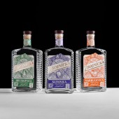
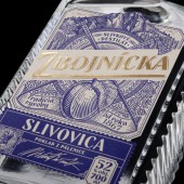
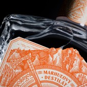
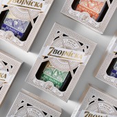
| DESIGN NAME: The Treasure of Zbojniks PRIMARY FUNCTION: Label INSPIRATION: People believed that Zbojniks have hidden their treasures on Velky Rozsutec mountain (this mountain is depicted at the top of the label). Traditionally, it is assumed that Zbojniks were hiding the gold stolen from the feudal lords in the mountains. But what else could be valuable for the mighty robbers? A good drink, of course, which is often valued more than any gold. The folk stories of Zbojniks - Slovak robbers - thus became the main source of inspiration for the label design. UNIQUE PROPERTIES / PROJECT DESCRIPTION: Zbojnicka, in Slovak, means belonging to a Zbojnik. Zbojniks were robbers, who participated in insurgencies against serfdom, in a way, they were the Slovak Robin Hoods of the Middle Ages. People believed that they have hidden numerous treasures in the Slovak mountains. Zbojnicka distillates are the true treasure of Zbojniks - this was the main idea in design creation. Each element of the label has its significance and tells unique stories from Slovak folklore. OPERATION / FLOW / INTERACTION: The work is displayed on the off-trade market (hypermarkets, supermarkets, wines & spirits shops, etc.). Due to its unique design and the story behind it, it manages to establish a dialogue between the the brand and the consumers, and at the same time, preserve and convey Slovak culture and traditions. PROJECT DURATION AND LOCATION: The project was launched on 1.4.2020 on the Slovak off-trade market (hypermarkets, supermarkets, wines & spirits shops, etc.). FITS BEST INTO CATEGORY: Packaging Design |
PRODUCTION / REALIZATION TECHNOLOGY: The label is printed on a glass bottle. Matte creme paper with a soft texture was chosen in order to evoke the feel of a natural and home-made product. The engraving-stylized illustrations create an impression of being transported into the past. The combination of Slovak ornaments from different regions enhances the image of a truly local, traditional product. The label is created in two colors, with only the name of the product, “Zbojnicka”, differing in terms of its colour and the printing technique. For it, gold embossing is used, which further associates the product with the treasures of Zbojniks. SPECIFICATIONS / TECHNICAL PROPERTIES: The dimensions of the bottle are 22cm x 10 cm x 6 cm (length x width x volume). The label size is 12 cm x 8 cm. TAGS: packaging, label design, print, Slovak folk culture, illustration, engraving, fruit distillates RESEARCH ABSTRACT: - CHALLENGE: The challenge was to create a unique and pronounced character and mood for the brand, to make the product distinguishable from its competitors, to attract attention to the product and facilitate a dialogue between the brand and the consumers, and at the same time to preserve and convey Slovak culture and traditions. ADDED DATE: 2021-06-23 15:55:47 TEAM MEMBERS (6) : Art Director: Sasha Sharavarau (Amoth Studio), Designer: Sasha Sharavarau (Amoth Studio), Illustrator: Tania Sharavarava, Artworker: Robert Specian, Photography: Jose Sabino (Sabino Studio) and Client: St.Nicolaus IMAGE CREDITS: Images #1-5 Art Director: Sasha Sharavarau (Amoth Studio) Designer: Sasha Sharavarau (Amoth Studio) Illustrator: Tania Sharavarava Artworker: Robert Specian Photography: Jose Sabino (Sabino Studio) |
||||
| Visit the following page to learn more: https://www.behance.net/gallery/11320594 |
|||||
| AWARD DETAILS | |
 |
The Treasure of Zbojniks Label by Sasha Sharavarau is Winner in Packaging Design Category, 2021 - 2022.· Read the interview with designer Sasha Sharavarau for design The Treasure of Zbojniks here.· Press Members: Login or Register to request an exclusive interview with Sasha Sharavarau. · Click here to register inorder to view the profile and other works by Sasha Sharavarau. |
| SOCIAL |
| + Add to Likes / Favorites | Send to My Email | Comment | Testimonials | View Press-Release | Press Kit |
Did you like Sasha Sharavarau's Packaging Design?
You will most likely enjoy other award winning packaging design as well.
Click here to view more Award Winning Packaging Design.


