DESIGN NAME:
Restrained Hidden
PRIMARY FUNCTION:
Residential
INSPIRATION:
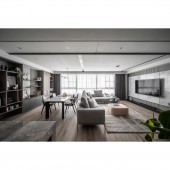
The designer extracted the client keenness to modern style as the central design concept using the depths of the ins and outs and the harmonic combinations between different materials; a few low-key luxury items are also added to bring out the client elegant and steady true self. The space sets off from the hexagonal bricks; it is then paired with special paints, greyscale paints, matte marble stones, and other odd elements, and natural daylight and indirect lightings to build up a transparent, bright, low-limit yet rich living space.
UNIQUE PROPERTIES / PROJECT DESCRIPTION:
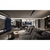
To transform the qualities into the specific spatial design, the designer applied three low-limit colors of grey, black, and white as the base of the plan; matte elements such as light-blue cabinets, marble stones, bright features such as mirrors and glasses have all decorated the space with a few sense of luxurious. At last, the application of layer changing of lights and shadows outlined the depth of field for the overall scene.
OPERATION / FLOW / INTERACTION:
A space not only echoes the aesthetic sense for living, but its traffic flow also has a significant impact on the users living styles. The designer applied an open-end method to the public area, connecting the entryway, the living room, the reading area, the kitchen, and other sectors to deliver a living attitude that the structure will not define. Inspirations for reading and writing could be born at the kitchen island, while meetings could be held at the reading area.
PROJECT DURATION AND LOCATION:
The project finished in February 2021 in Taiwan.
FITS BEST INTO CATEGORY:
Interior Space and Exhibition Design
|
PRODUCTION / REALIZATION TECHNOLOGY:
Modeled mirrors, special paints, baking paints, marble stones, grey mirrors, system panels, hexagonal bricks, wooden floorings, big planks
SPECIFICATIONS / TECHNICAL PROPERTIES:
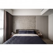
The indoor area is 46 ping. The designing area included the entryway, the living room, the reading area, the dining room, and the kitchen of the public area; the private area consists of the master bedroom and bathroom, the secondary bedroom and bathroom, and the study.
TAGS:
modern style, authentic taste, purely visual design, steady and elegant qualities
RESEARCH ABSTRACT:
Special paints and indirect lightings are used to outline the depth of field, while vivid hexagonal bricks are used as the flooring to transform emotions erase the busyness and tiredness of the owners. Antique-like marble stones are applied as the theme of the public area; the designer hoped to deliver a borderless frame through the restrained colors of marble stones. Meanwhile, the television wall used painted lattices and bright blue cabinets to echo the marble stones, detailing the smooth yet low-profile sense of the space.
CHALLENGE:
To eliminate the massive beam of the public area, the designer applied a divided linear that is clean and neat to digest the given pressure. Considering the location arrangement of the pipelines and air conditioners, the designer used consistent ceiling height to soften the structure beams after precise measurement. At the same time, hexagonal bricks, wooden floorings, and big planks are paired for the flooring selection, another ingenuity the designer came up with to balance the visual sense of the ceiling and the flooring.
ADDED DATE:
2021-06-23 07:16:16
TEAM MEMBERS (1) :
Ching-Lin Yu, Jian-Hong Luo
IMAGE CREDITS:
Ching Yi Interior Design Co., Ltd.
|


