DESIGN NAME:
Frame of Color
PRIMARY FUNCTION:
Residential
INSPIRATION:
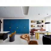
As astronaut Neil Armstrong landed on the moon, which means humankind has stepped onto another planet besides Earth. Based on the news, since 1967, the trend of space has raised up. At the same time, the splendid color concept and curved shape style had become popular with the name, space pop art, in the 70s. Furthermore, the style is to decorate with valchromat so as to leave several blank spaces to make people focus on the furniture.
UNIQUE PROPERTIES / PROJECT DESCRIPTION:
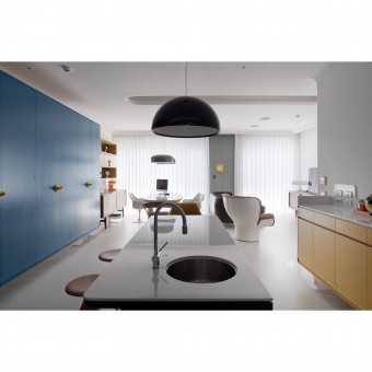
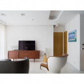
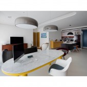
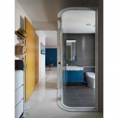
Outlined the frame of the furniture with color blocks. As to the public domains such as the dining area and the living room, the designer has utilized black, yellow, and blue valchromat as the key visual. There have been left several blank spaces to bring out the theme of the space. The hovering design has made the painting canvas located in the middle of the domain. The kitchen island has connected to the floor with white color and the dining table is in black which is consistent with the way they have hung the painting canvas.
OPERATION / FLOW / INTERACTION:
The client of the mansion is two sisters so they have chosen yellow as their gate color which has connected to the public domains. However, the concept of curved shapes and color blocks have extended to the private area, and according to the character of the sisters, the designer has modified the use of the color and style.
PROJECT DURATION AND LOCATION:
The project finished in Taiwan.
FITS BEST INTO CATEGORY:
Interior Space and Exhibition Design
|
PRODUCTION / REALIZATION TECHNOLOGY:
In order to manufacture the color blocks in a curved shape, the designer has chosen the material of valchromat which is easier to construct on its surface. In addition, seamless flooring is used in the house and the designer has also painted the house in pure white to bring out the main color and the classic furniture. As to the entry, the bright marble is used as the frame and with the extension of it, the contrast between the floor in matte texture has made a theme.
SPECIFICATIONS / TECHNICAL PROPERTIES:
In order to bring out the color of the furniture, the designer has made the walls and ceiling the priority of construction, the facade that connects to the ceiling is designed in a curved shape which is for the purpose of maintaining consistency as well bilayer ceiling. At the same time, so as to make the space look white and wide, the designer has distinguished the areas with ornaments which is for the sake of maintaining the consistency of the canvas and making the space look wider.
TAGS:
classic retro, modern, vivid colors, vivid and bright color
RESEARCH ABSTRACT:
The designer has chosen vivid colors and modern curved lines from the 70s space pop art as the axis but it is surrounded by the pure white canvas which is for the purpose of bringing out the classic retro furniture. In order to maintain consistency, the designer has used seamless flooring in matte texture which extends to the inner space as a pure and clean canvas. At the same time, the designer has made the bright marble lean on the wall which has created a contrast with the floor and the flow line is shown clearly.
CHALLENGE:
The main axis, the classic furniture, is surrounded by curved shapes and colors. After the concept of the design is complete, how to find adequate furniture to make the space vivid is one of the criteria. Therefore, the designer has made the curved shapes and the unique bright colors from the 70s space pop art as the main visual theme. At the same time, the copies and replicas are eliminated.
ADDED DATE:
2021-06-22 11:05:21
TEAM MEMBERS (1) :
Wen-Chau Chen
IMAGE CREDITS:
Mid20th Kiosk
|
